
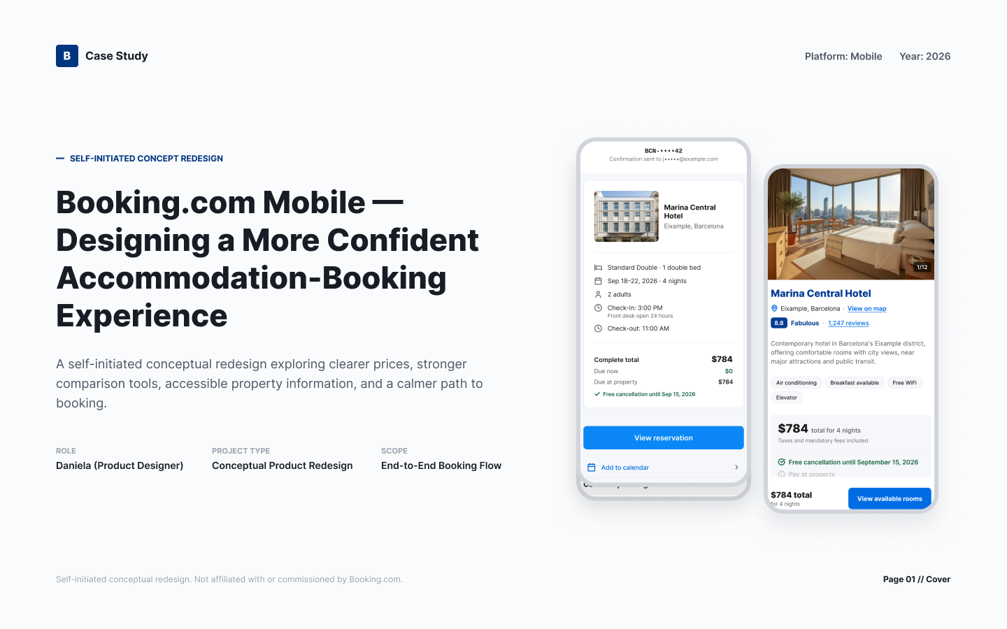
Booking.com Mobile — Designing a More Confident Accommodation-Booking Experience
A conceptual mobile redesign exploring clearer total prices, stronger comparison tools, accessible property information, and a calmer path from search to reservation management.
- Role
- Product design, UX strategy, interaction design, visual design, prototyping, and accessibility
- Project type
- Self-initiated conceptual product redesign
- Platform
- Mobile
- Year
- 2026
- Scope
- End-to-end accommodation booking and reservation-management experience
02
Project context
This project began in 2021 as four visual onboarding screens: a Booking.com splash/welcome screen, a flight and travel-services introduction screen, a travel-category introduction screen with placeholder copy, and a road-trip introduction screen with placeholder copy.
That earlier work established an illustration direction and an early visual tone. It did not include a defined user problem, a research foundation, a functional booking journey, a design system, accessibility specifications, or an end-to-end interaction flow — it was never intended to.
The 2026 work on this page is a distinct, full conceptual redesign. It is built around a stated problem, a design system, an end-to-end flow, and accessibility considerations, none of which existed in the 2021 screens.
2021 — Visual foundation
Four onboarding screens. Illustration direction and visual tone only. No problem statement, research, system, or flow.
2026 — Full conceptual redesign
Problem statement, design principles, end-to-end flow, 12 principal screens, 10 supporting states, a design system, and a conceptual accessibility approach.
03
Problem and scope
How might we help leisure travelers confidently find and book the right accommodation while making price, location, amenities, accessibility information, reviews, and cancellation conditions easier to understand?
In scope
Mobile accommodation search, evaluation, booking, confirmation, and reservation management.
Out of scope
Flights, cars, attractions, supplier tools, desktop redesign, and implementation.
04
Research approach
No primary interviews or usability testing were completed for this project.
The work used secondary research, competitive analysis, hypothesis mapping, a UX heuristic review, an accessibility review, and conceptual prototyping. No participants, quotations, findings, metrics, or usability results are presented anywhere on this page.
Every behavioral assumption or product opportunity described below is labeled as an unvalidated hypothesis.
05
Product strategy
Show complete prices early
Total trip cost, taxes, and fees appear at the point of comparison rather than at the end of checkout, so a number a traveler sees is a number they can act on.
Reduce comparison effort
Saving, comparing, and returning to candidates is built into the flow so travelers do not have to hold details in memory or restart their search.
Explain policies in plain language
Cancellation terms, payment timing, and change conditions are written in ordinary words and placed before commitment, not buried in fine print.
Support accessible and recoverable journeys
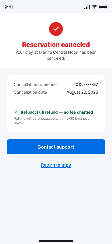
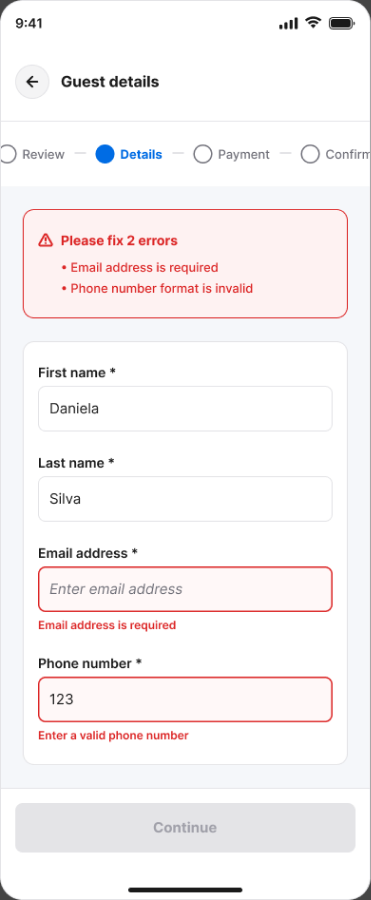
Every state — including errors, price changes, and cancellations — offers a clear next action, readable status text, and accessible touch targets.
06
User flow
Principal journey
- 01Search
- 02Results
- 03Filter or map
- 04Compare
- 05Property details
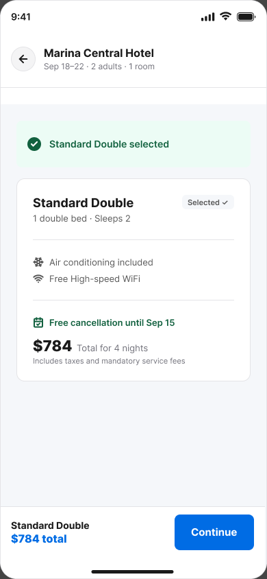
- 06Room selection
- 07Booking review
- 08Confirmation
- 09Reservation management
Supporting states
- Price changes
- Required-field errors
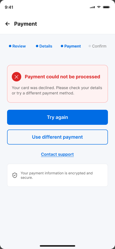
- Payment failure
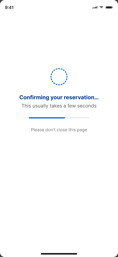
- Processing
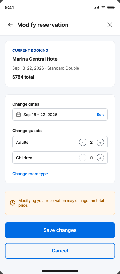
- Modification
- Cancellation
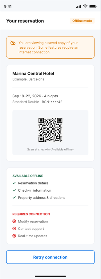
- Offline access
07
Key solution — price confidence
The concept surfaces the complete cost of a stay at each decision point: in the results list, on the property page, and again in booking review before payment. Cancellation terms sit next to the price rather than behind a separate link.
Unvalidated hypothesisTravelers abandon or lose trust when the price they compared is not the price they pay; showing total trip cost earlier may reduce that friction. This has not been tested.
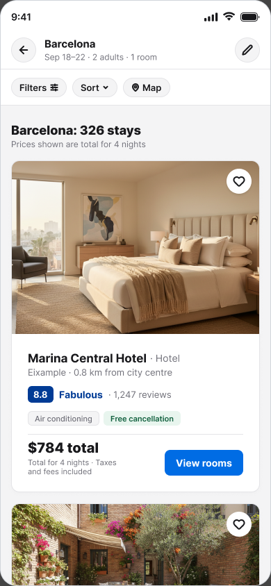
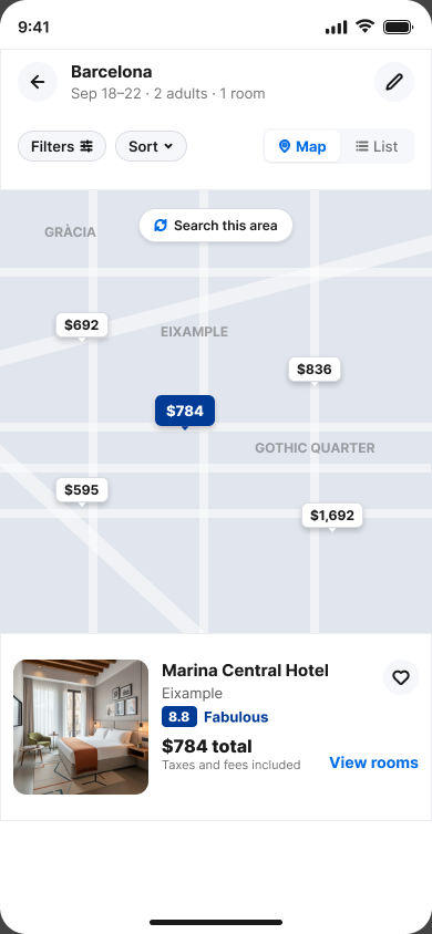
Results show a total trip price per property, so the comparison a traveler makes in the list is the same comparison that holds at checkout.
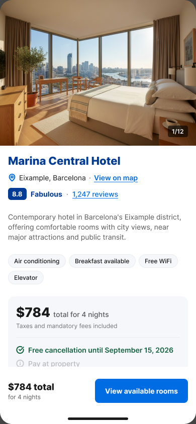
Taxes and fees are itemised on the property page alongside amenities, rather than appearing as a late adjustment.
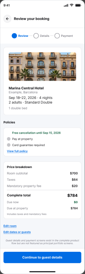
The final review repeats the full breakdown and the cancellation policy before any payment commitment is made.
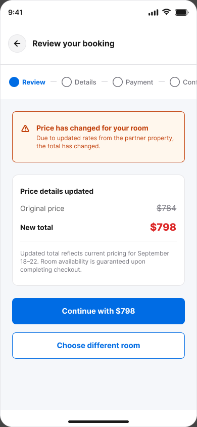
If a price changes mid-flow, the change is stated plainly with a clear choice: accept the new total or return to results.
08
Key solution — property evaluation
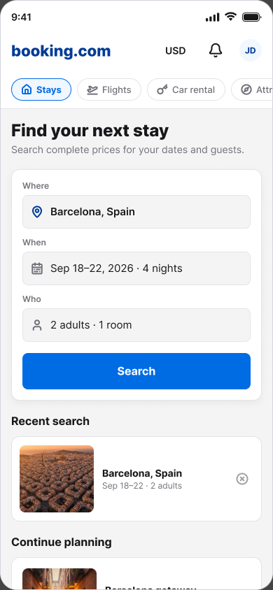
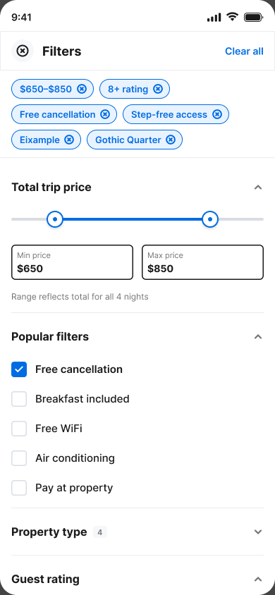
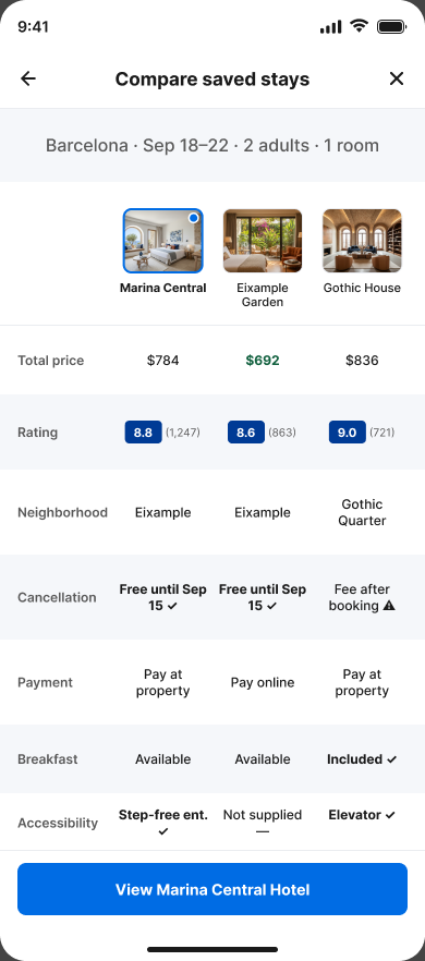
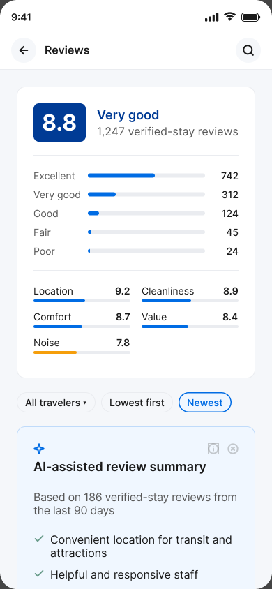
The design intent is to let travelers weigh price, location, reviews, cancellation terms, payment timing, and accessibility information without losing their search context — moving between list, map, saved items, and detail without restarting.
This is stated as design intent, not a validated outcome.
Unvalidated hypothesisComparison effort is a meaningful source of decision fatigue in accommodation booking. Primary research would be required to confirm this.
09
Booking and management
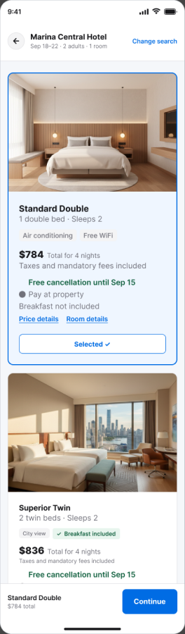
The path from room selection to a managed reservation is treated as one continuous experience, including the states that occur after booking: modification limits, cancellation, and offline access to reservation details.
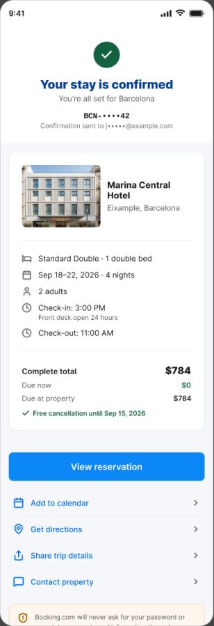
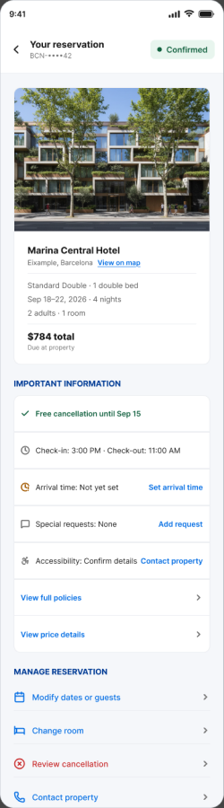
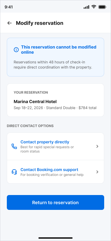
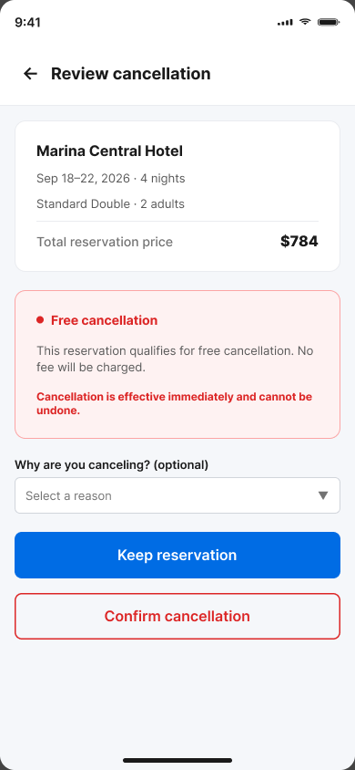
Other supporting states
10
Design system
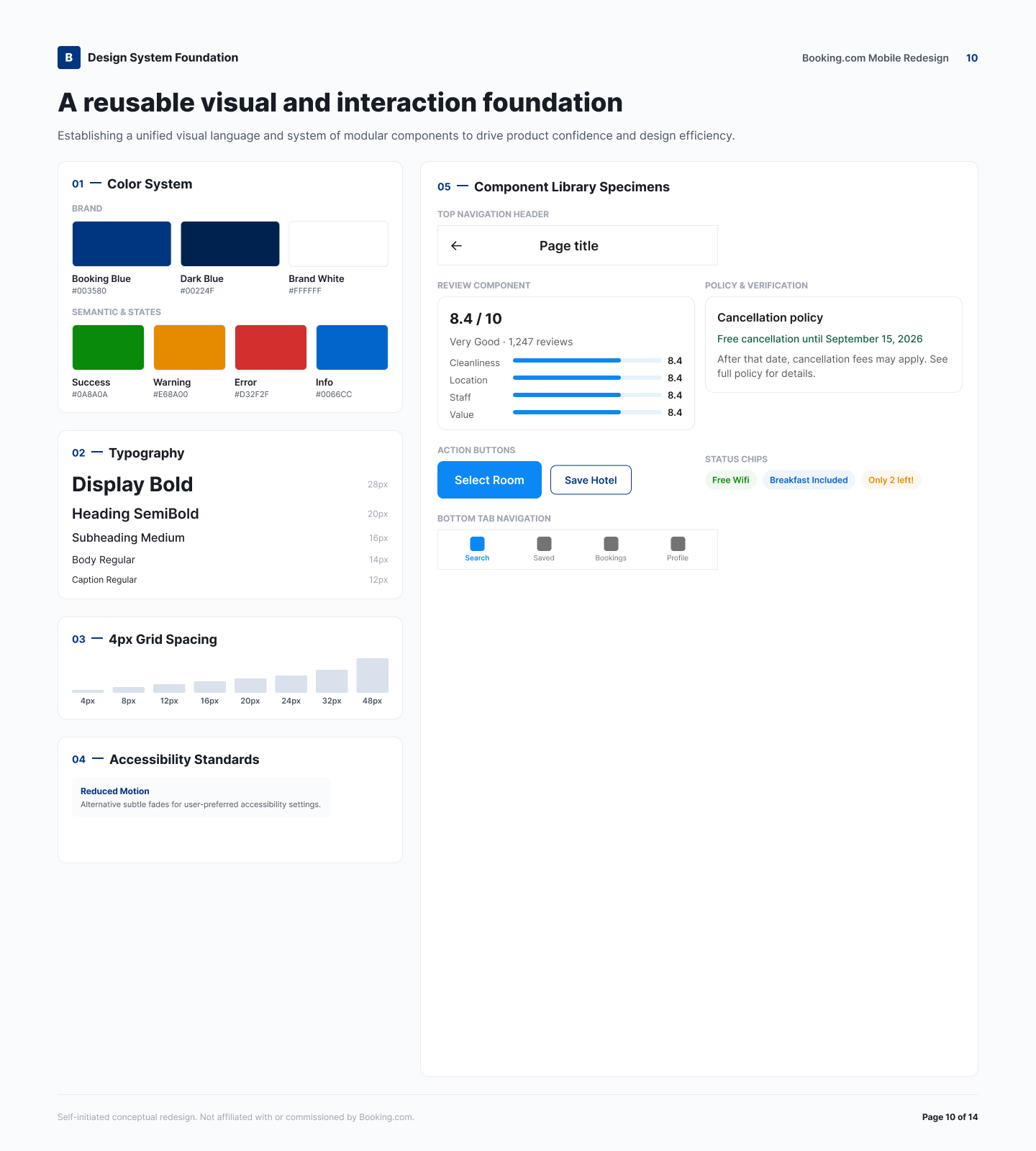
- A Booking-inspired blue colour foundation.
- A defined typography hierarchy for headings, body, and supporting text.
- A four-pixel spacing system driving all layout rhythm.
- Reusable components for cards, inputs, price rows, and status messaging.
- Semantic success, warning, error, and information states.
- Minimum 44×44px touch targets on all interactive elements.
- Text labels used in addition to colour — never colour alone.
- Reduced-motion considerations for transitions and animated feedback.
11
Responsible AI and accessibility
AI-assisted review summaries
AI-assisted review summaries are a concept feature. They are optional, dismissible, and clearly disclosed as AI-generated, and they carry a visible warning that a summary may miss context present in the full reviews.
Conceptual accessibility approach
- WCAG 2.2 AA as the target standard.
- Plain-language status messages for every system state.
- Visible focus and error states.
- Touch-target sizing on all controls.
- Screen-reader-friendly labels.
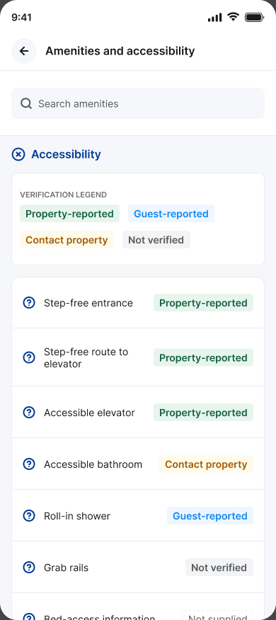
- Accessibility information presented with its verification source.
No accessibility claim on this page should be read as formally audited or user-validated. This is a conceptual approach only.
12
Outcome, limitations, and next steps
Deliverables
- End-to-end mobile concept
- 12 principal high-fidelity screens
- 10 supporting states
- A reusable design system
- An interactive prototype
- This portfolio case study
Limitations
- No participant interviews
- No usability testing
- No production implementation
- No measured business outcomes
- Product opportunities remain hypotheses requiring primary research
Next steps
- Conduct 6–8 interviews
- Test price-comprehension and comparison tasks
- Validate accessibility information requirements
- Test checkout recovery and cancellation flows
- Iterate from observed evidence