
Case Study
Platform: Mobile App (iOS)Year: 2026
Multi-Device Product Design
Beat Music — Mobile App Design
Designing a personalized music streaming experience with mood-based discovery and social features.
- Brand
- Beat Music
- Industry
- Music Streaming
- Role
- UI and UX Designer
Conceptual design case study. All assets and mockups created for portfolio demonstration purposes.
Context & Strategy
Creating a music app that feels personal
The mobile music streaming market is highly saturated, dominated by giants that rely heavily on generic algorithmic curation. The challenge of this project was to design a platform from scratch that differentiates through emotional context — utilizing mood-based discovery patterns, bespoke onboarding preferences, and an immersive, tactile playback system.
We focused heavily on the initial touchpoints, understanding how to progressive-disclose selections (genres first, then targeted artists) so that the user's home experience immediately reflects their current sonic identity.
Brand Identity
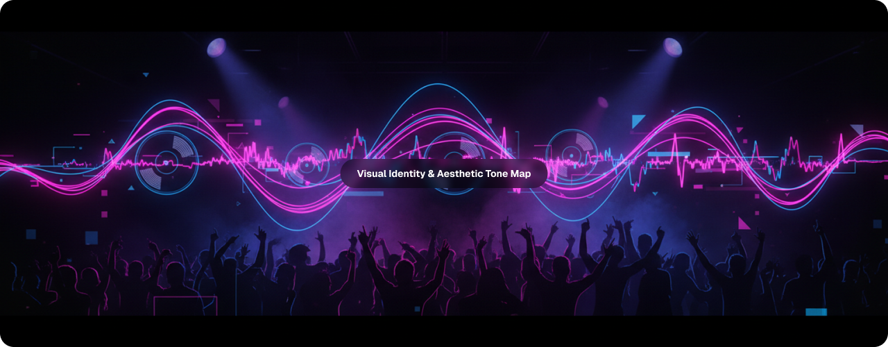
Setting the tone — brand moodboard
To convey the rhythmic, emotional heart of Beat Music, we curated a visual board exploring deep, low-key night-club lighting, bright neon gradients, tactile vinyl textures, and organic soundwave flows. The visual register values energetic and vibrant accents against a pitch-dark canvas.
Spatial Architecture
Starting with structure — low-fidelity wireframes
Before applying any high-contrast brand gradients, we established layouts in low-fidelity. This ensured content rows, navigation tabs, and control zones were highly functional, prioritizing muscle memory and thumb ergonomics.
Login / Entry
Centered logo with clean text input fields and clear primary action pathways.
Home Discovery
Horizontal featured banner with mood category cards and quick toggles.
Media Player
Centered artwork frame flanked by simple play, skip, and emotional reaction controls.
Walkthrough 1
Large centered graphic illustrative space with high-level benefit copy.
Walkthrough 2
Visual layout mapping out specific personalizing preferences steps.
HiFi Interface Showcase
High-fidelity UI — bringing the beat to life
By layering vibrant pink-to-blue linear gradients over a dark, sleek midnight canvas, Beat Music achieves an energetic aesthetic tailored for younger demographics. The interface maximizes cover-art visibility while keeping secondary controls accessible.
LOGIN
SubmitSIGN UP
SubmitMusic On Demand
NextPersonalized Mixes
NextLive Radio Access
Start PlayingSelect Genres
Favorite Artists

Core Experience Spotlights
Key design decisions
1. Mood-Based Discovery
The core discover engine is oriented around immediate mood states rather than genres. On the dashboard, users see a horizontally scrolling set of emotional buckets—Because, Pity, Motivation, Workout—that update dynamically depending on the time of day, current weather, and past historical cycles.
Choose your favorite artists
Get personalized recommendations
2. Progressive Onboarding Personalization
We reduced sign-up churn by creating a progressive setup flow. Rather than a dense sign-up questionnaire, the user enters genres first, then targeted artists that are automatically generated dynamically. Selection is highly tactile—relying on satisfying tap gestures and glowing visual confirmation states.
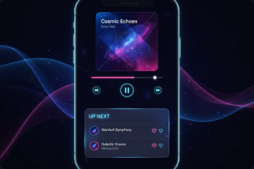
3. Immersive Playback Queue
The music player is treated as an immersive space. The cover artwork dominates the top portion, while a swipe gesture immediately triggers an interactive bottom-sheet containing the queue and up-next track previews. Like/dislike micro-interactions directly feed recommendation engines with zero friction.
Process Transition
From wireframes to final UI
1. Login Screen Evolution
The wireframe establishes core input heights and spacing budgets. The final high-fidelity design elevates this structure with robust neon ambient backgrounds, subtle glassmorphism input cards, and sleek button components.
2. Home Dashboard Evolution
The dashboard maintains its three-tier composition: featured carousel on top, followed by circular mood selection tags, and a unified mini-player bar nested at the bottom.
Reflection & Future Work
Reflection and takeaways
What I Learned
Mood-Based UX Architecture
Designing interfaces centered on emotional triggers requires soft, conversational terminology and visual cues that adapt contextually. It taught me how to bypass mechanical searching in favor of emotional matching.
Tactile Mobile Onboarding
Onboarding isn't just a setup chore. Moving details forward, such as selecting artist bubbles with micro-reactions, turns form-filling into an enjoyable game.
What I Would Do Differently
Validate with Real User Curation
While the emotional categories felt logical during our design process, running card-sorting tests with diverse music fans would expose whether "Workout" or "Because" means the same things to everyone.
Expand Social Curation
Due to the 6-week timeframe, social integrations were kept at high-level indicators. Given more scope, I would design a "Friend Activity" drawer and shared queue interfaces.
This is a conceptual design exercise — not a shipped product. The designs reflect assumed interaction models based on competitive analysis of existing streaming platforms. Production-readiness would require user research, accessibility auditing, motion design, and engineering feasibility review across target devices.