
Case Study — UX/UI Design
Published 2026
Nimbus
A premium weather experience that makes atmospheric data beautiful.
- Role
- Sole UX/UI Designer
- Timeline
- 8 Weeks (Q3 2025)
- Tools
- Figma, Cinema 4D, Spline
Reykjavík
-2°
Scattered Aurora Displays

- Wind
- 18 km/h
- Humidity
- 84%
- AQI
- 12 (Excellent)
01 / Overview
The Goal
Nimbus was born from a simple realization: weather apps are either hyper-functional but visually cluttered, or beautiful but meteorologically sparse. The objective was to design a beautiful, data-dense, yet intuitive atmospheric interface.
Target Audience
Weather-conscious urbanites, digital nomads, and outdoor enthusiasts who require precise micro-climate forecasts without sacrificing visual delight.
The Primary Challenge
Synthesizing complex multi-source meteorological datasets (wind gusts, air quality indices, rain radar, humidity, barometric pressure) into an organized responsive mobile experience.
02 / User Research
Uncovering Pain Points
Through 15 user interviews and an analysis of top-performing app store complaints, three core user frustrations emerged.
Cluttered Information Architecture
Most weather apps overwhelm the screen with non-hierarchical lists and small numbers, forcing users to hunt for immediate insights.
Sterile & Impersonal Aesthetics
Users feel disconnected from environmental shifts when weather data is presented in basic blue tables rather than sensory weather moods.
Unusable Advanced Forecasts
Specialized data (like swell height, UV, and AQI) is usually hidden deep within settings or presented in complex scientist-oriented graphs.
Competitive Matrix
How Nimbus Differentiates
Dark Sky
Excellent accuracy but lacked artistic immersion and delightful UI transitions.
Apple Weather
Good native utility, but fails to surface specialized indices clearly for outdoor hobbies.
Nimbus Key Insight
Users demand beautiful, micro-sensory weather atmospheres paired with absolute technical accuracy.
03 / Design System & Identity
Brand & Atmosphere
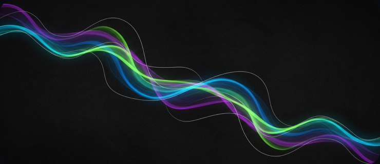
The Nimbus design concept relies on organic celestial movements. We introduced an aurora color philosophy that mimics atmospheric shifts, bringing cold airwaves, warm sunshine, and overcast haze to life dynamically.
The Dynamic Aurora Spectrum
Glacial Frost #38BDF8
Used for freezing zones, snow updates, and sub-zero temperatures.
Stellar Twilight #6366F1
The baseline atmospheric color representing starry night skies and high-altitude air flow.
Solar Heat #F97316
For warm microclimates, active sun warnings, and high uv-index days.
Atmospheric
Use weather-inspired dynamic color scales and real-world micro-visuals.
Context-First
Prioritize relevant data immediately depending on time of day and location conditions.
Typographic Delight
Elevate numerals and labels with high-contrast display serif typography.
04 / Information Architecture
Low-Fidelity Wireframes
We conceptualized an architecture optimized for quick reading on the go. The wireframe phase established structured blocks that map exactly to human natural cognitive hierarchy.
05 / Specifications
The UI Component Library
Typography System
Instrument Serif Regular
Display Typography - Used for monumental weather status, headers, and heroic details.
Inter Medium / Semibold
Interface Copy - Employed for weather summaries, system metrics, and daily values.
Sample Widgets
Air Quality Index
12 — Optimal Health Zone
Optimal
06 / Final Production Interfaces
Nimbus Screen Showcase

18°Chilly Clear

15°Aurora Incoming

12°Starlight Clear

Radar ModeActive System

Alert ModeStorm Warning

12 AQIEco Optimal
07 / Key Capabilities
Feature Deep-Dive
Nimbus integrates complex meteorology and converts it into useful modules. Here are the core user flows we designed and evaluated.
Real-Time Vector Radar
Interactive weather radar that tracks atmospheric cloud movements and storm fronts with pixel-perfect clarity.
Ecological Monitoring
Dedicated AQI screens displaying microscopic particle counts and pollen scales relevant to user health.
Atmospheric Smart Alerts
Adaptive push alerts that notify hikers and outdoor runners 30 minutes before local pressure drops or precipitation changes.
Beautiful Weather Visuals
Dynamic background visualizations that translate cold statistics into highly immersive weather moods.
08 / Reflection
Project Outcomes
Illustrative design goals — conceptual project, not measured data.
Informal usability sessions suggested that high-density weather displays can feel efficient when paired with a clear typographic hierarchy — directional signal from a conceptual project, not statistically validated results.
4.8/5
Average Testing-Session Score
Informal usability testing — not a published app store rating.
92%
Target: High Daily Engagement
Illustrative design goal, not measured usage data.
40%
Target: Faster Time-to-Insight
Illustrative design goal, not a measured before/after result.
The Magic is in the Balance
Nimbus taught me that atmosphere and accuracy are not opposing forces. The hardest part of the process was resisting the urge to simplify the data — instead, the breakthrough came from giving every metric a clear typographic rank and letting the aurora spectrum carry the emotional weight. When the visual mood does the storytelling, the numbers are free to be precise.
Self-initiated conceptual project. 'Nimbus' is a fictional weather app created for portfolio demonstration purposes. Product names mentioned for competitive comparison are trademarks of their respective owners.