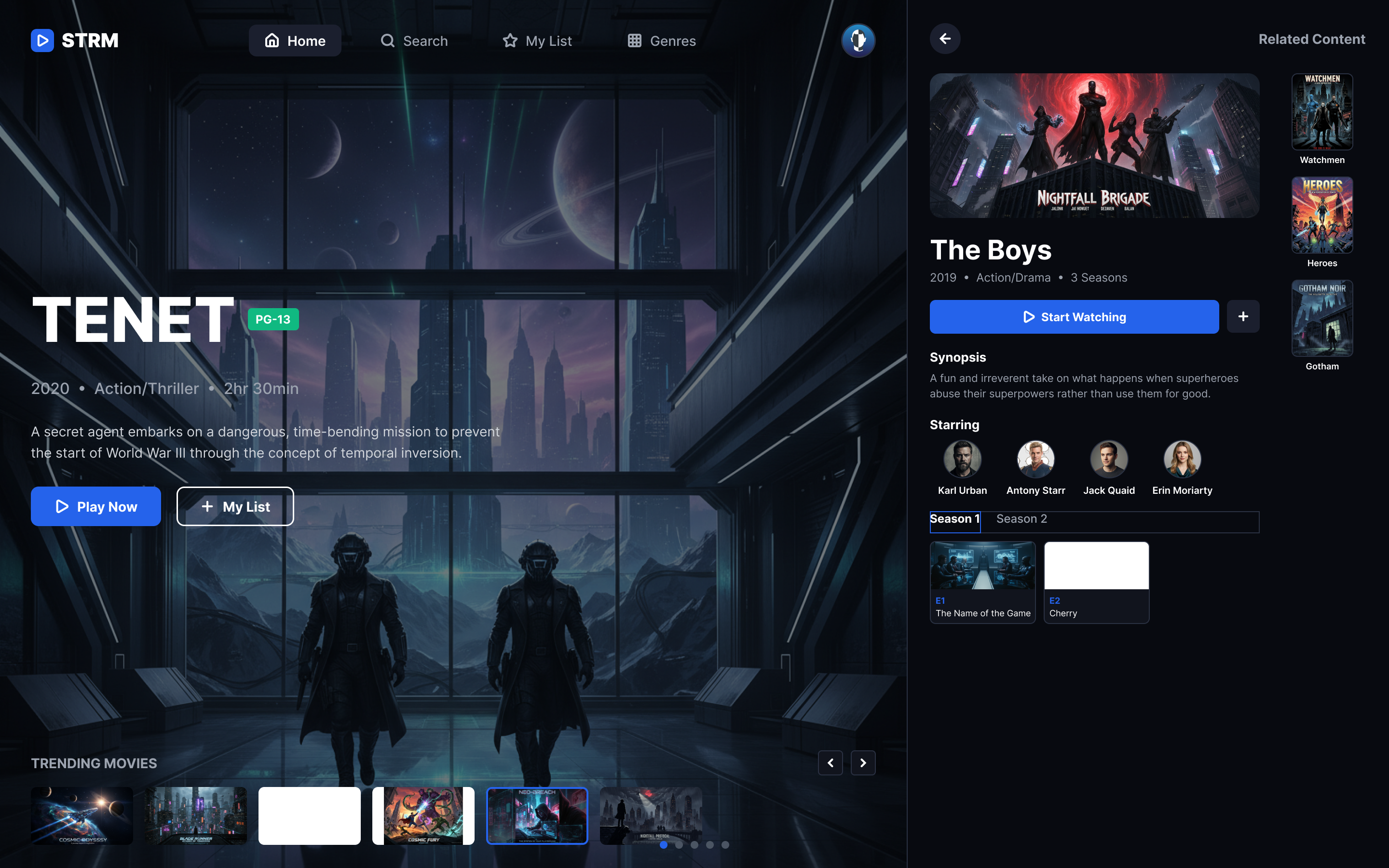
Conceptual Design Exercise
Multi-Device Automotive Redesign
BMW X5 — Website Redesign
Reimagining the luxury SUV configuration & discovery experience across desktop and mobile devices.
- Brand
- BMW North America
- Industry
- Luxury Automotive
- Role
- Solo UI & UX Designer
Conceptual automotive case study. Created for educational and presentation purposes.
By: Daniela Koulentianos — UX/Product Design Portfolio
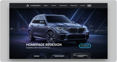
- Desktop
- Mobile
Context & Challenge
Evolving the premium configuration experience
BMW customers expect an immersive, seamless digital companion that reflects the physical luxury of their vehicles. However, the legacy model pages struggled with complex parameters, dense spec lists, and friction points in the custom vehicle builder.
The objective of this design sprint was to modernize the digital journey: designing a high-impact responsive platform that elevates visual storytelling while providing clear, interactive configuration paths for buyers.
Methodology NoteThis case study details a conceptual redesign project aiming to test information architecture scaling on high-fidelity display spaces. All assets and mockups represent purely exploratory work.
Design Process & Architecture
Structuring the vehicle showcase — low-fidelity wireframes
Gray-box wireframing allowed us to map critical interactive flows—like paint swatches, model tabs, and specs matrices—ensuring the responsive transition between mobile and desktop maintained high readability.
Mobile Homepage
Hero banner positioning and primary CTA placement optimized for quick tap flow.
Masonry Gallery
Multi-column layout structure supporting responsive asset scaling and swift scrolling.
Model Detail Configuration
Stacked specs matrix and color swatch indicators optimized for finger-tap targets.
Wireframes deliberately use placeholder blocks to focus review on information hierarchy and spatial relationships rather than visual aesthetics.
High-Fidelity Interface
High-fidelity UI — bringing the experience to life
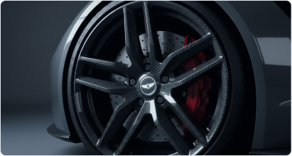
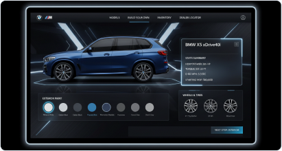
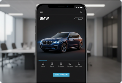
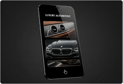
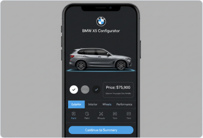
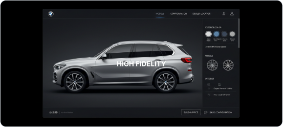
A premium, high-contrast dark aesthetic highlights the vehicle's form. The design features rich editorial visuals, simplified selector flows, and crisp tech specifications.
Desktop Web Experiences
Mobile Interfaces
Wireframe to Final Evolution
Validating spatial architecture
Homepage Redesign Evolution
Wireframe-first structuring validated the hero-and-CTA hierarchy before the high-contrast automotive photography and dark theme were applied.
Configurator Details Evolution
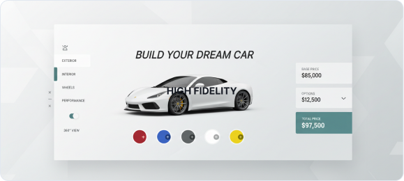
The configurator wireframe's dense spec/swatch layout carried through to the final build-your-own flow with real pricing feedback.
Reflection and takeaways
What I learned
Structuring complex datasets like model variants, horsepower, and torque requires clean, intuitive grids. High-contrast overlays ensure vehicle paint options stand out clearly on dark themes, and touch-friendly mobile navigation is essential for fluid responsive conversion during active configuration.
What I would do differently
- Conduct deeper A/B user testing on color selector configurations
- Include an immersive 360-degree interactive canvas on mobile models
- Optimize high-resolution asset loading speeds for standard mobile networks
This case study represents a conceptual exercise exploring layout structures for premium automotive platforms. It was designed independently to test UI hierarchy scaling across diverse screens.
Self-initiated conceptual redesign. Not affiliated with, endorsed by, or commissioned by BMW AG or BMW of North America. BMW is a trademark of its respective owner.