Conceptual Design Exercise
Multi-Device Product Design
Streaming App — TV & iPad Experience
Designing a multi-device entertainment platform across TV, tablet, and mobile form factors.
- Role
- UX/UI Designer
- Platform
- TV / iPad / Mobile
- Project Type
- Conceptual Design Exercise
Conceptual design case study. All assets and mockups created for portfolio demonstration purposes.
By: Daniela Koulentianos — UX/Product Design Portfolio
- TV
- iPad
- Mobile
Context & Strategy
Exploring multi-device streaming interfaces
This conceptual project explores the design of a streaming entertainment app across multiple device form factors — from large-screen TV interfaces to iPad tablet layouts. The goal was to understand how content browsing, discovery, and detail patterns adapt when the same service spans dramatically different screen sizes and interaction paradigms.
By isolating these core touchpoints, the architecture aims to map out unified user journeys that maintain a cohesive brand feel while respecting the unique ergonomic and navigational bounds of each respective display type.
Methodology NoteThis is a self-initiated design exercise exploring multi-device UX patterns. No user research was conducted, and the designs reflect assumed interaction models that would require validation before production use.
Spatial Architecture & Schematics
Starting with structure — low-fidelity wireframes
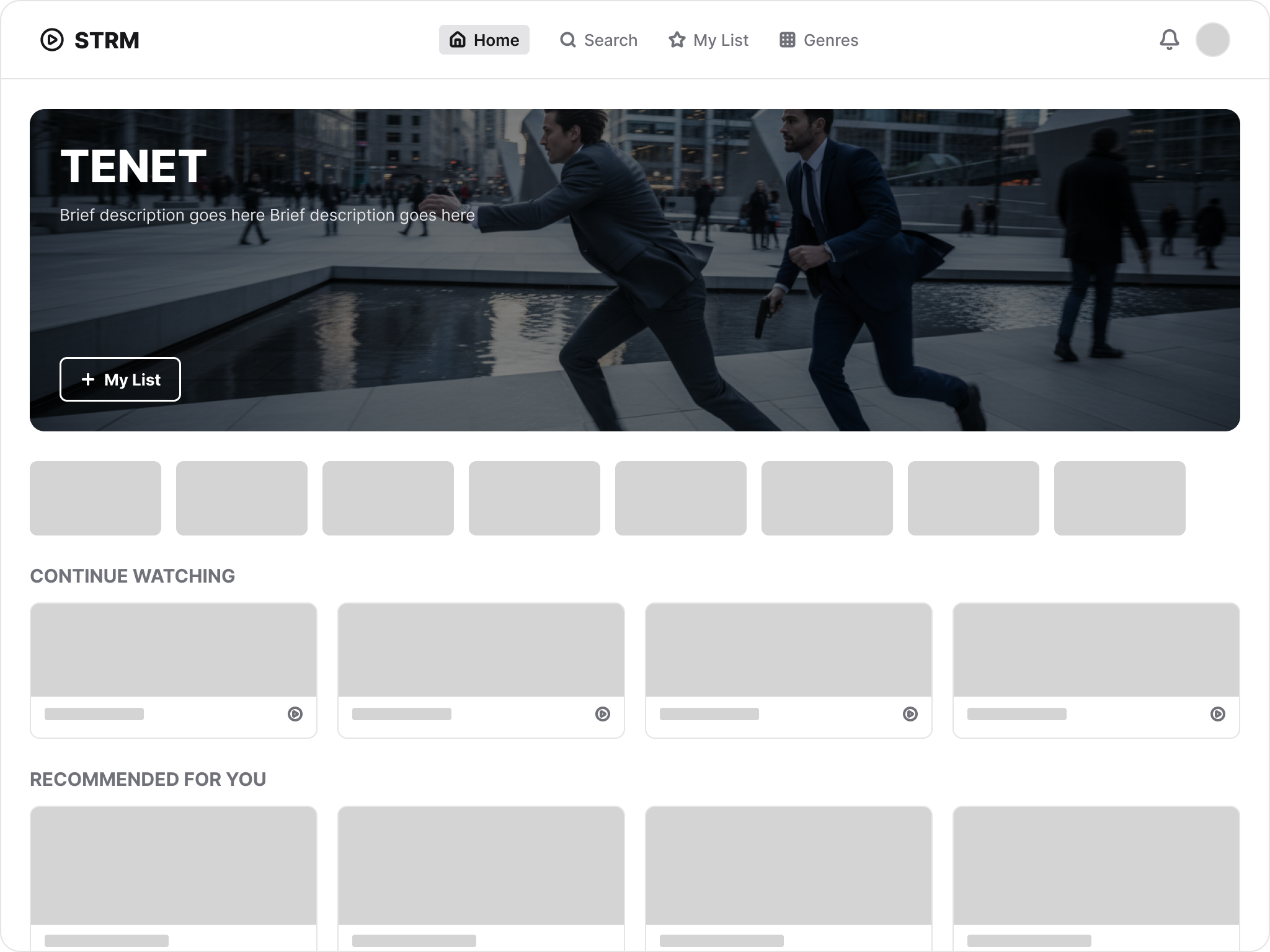
Gray-box wireframes established layout hierarchy, content zones, and navigation patterns before any visual design decisions were made.
Landing Page Wireframe
Hero-dominant layout with horizontally scrolling content rows. Navigation bar establishes the four primary destinations: Home, Search, My List, and Genres.
Show Details Wireframe
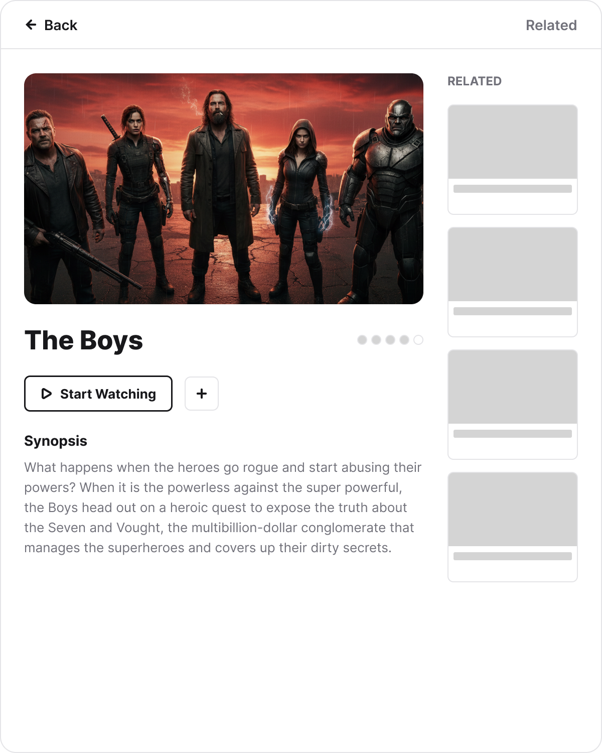
Detail view splits into primary content (hero, metadata, synopsis) and a Related sidebar. Gray placeholders represent where poster imagery would populate.
Wireframes deliberately use placeholder blocks to focus review on information hierarchy and spatial relationships rather than visual aesthetics.
Case Study
High-fidelity UI — bringing the experience to life
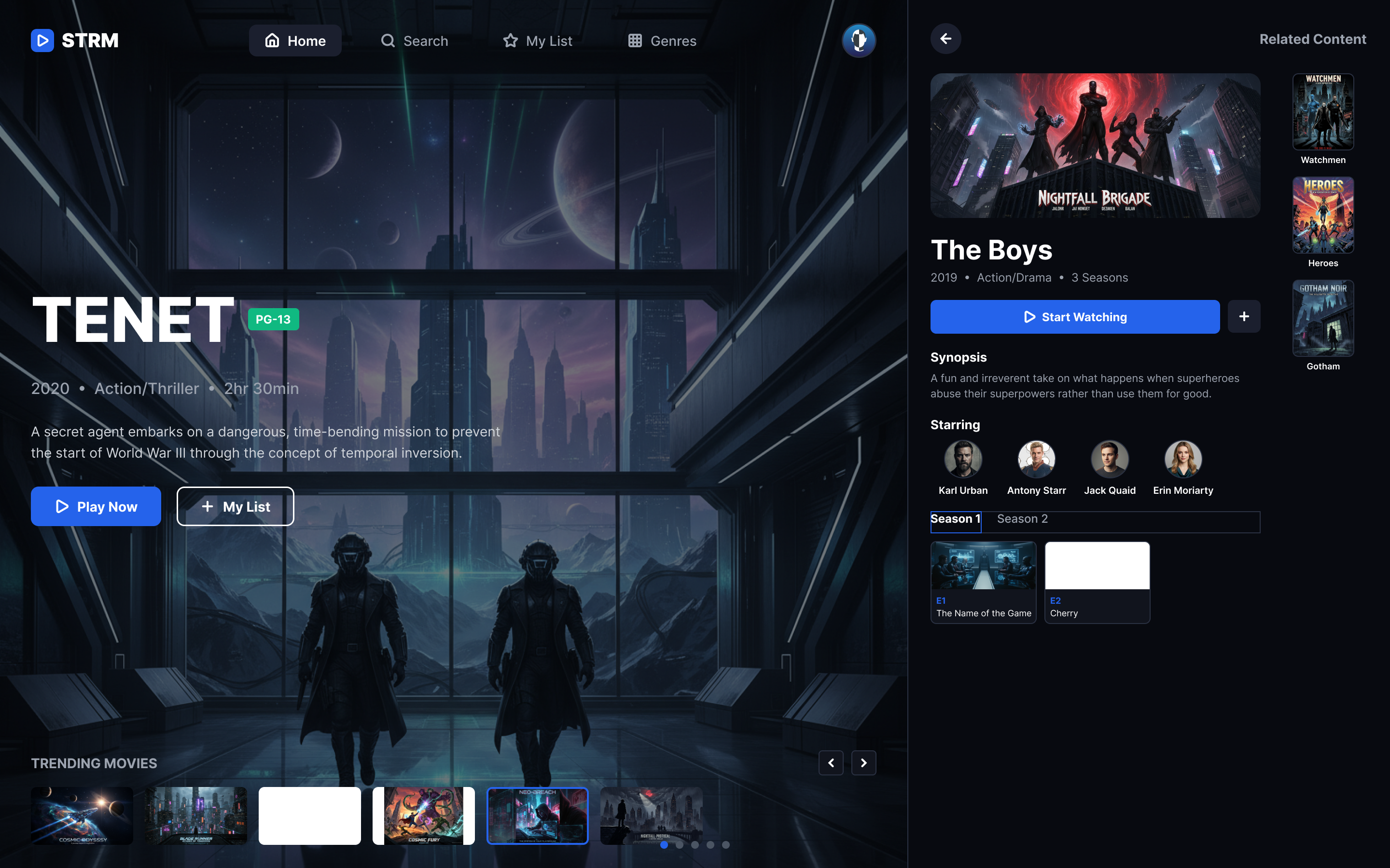
With structure validated, visual design applied the dark cinematic aesthetic that streaming platforms demand — rich imagery, high contrast, and content-first hierarchy.
TV Experience
iPad Tablet Screens
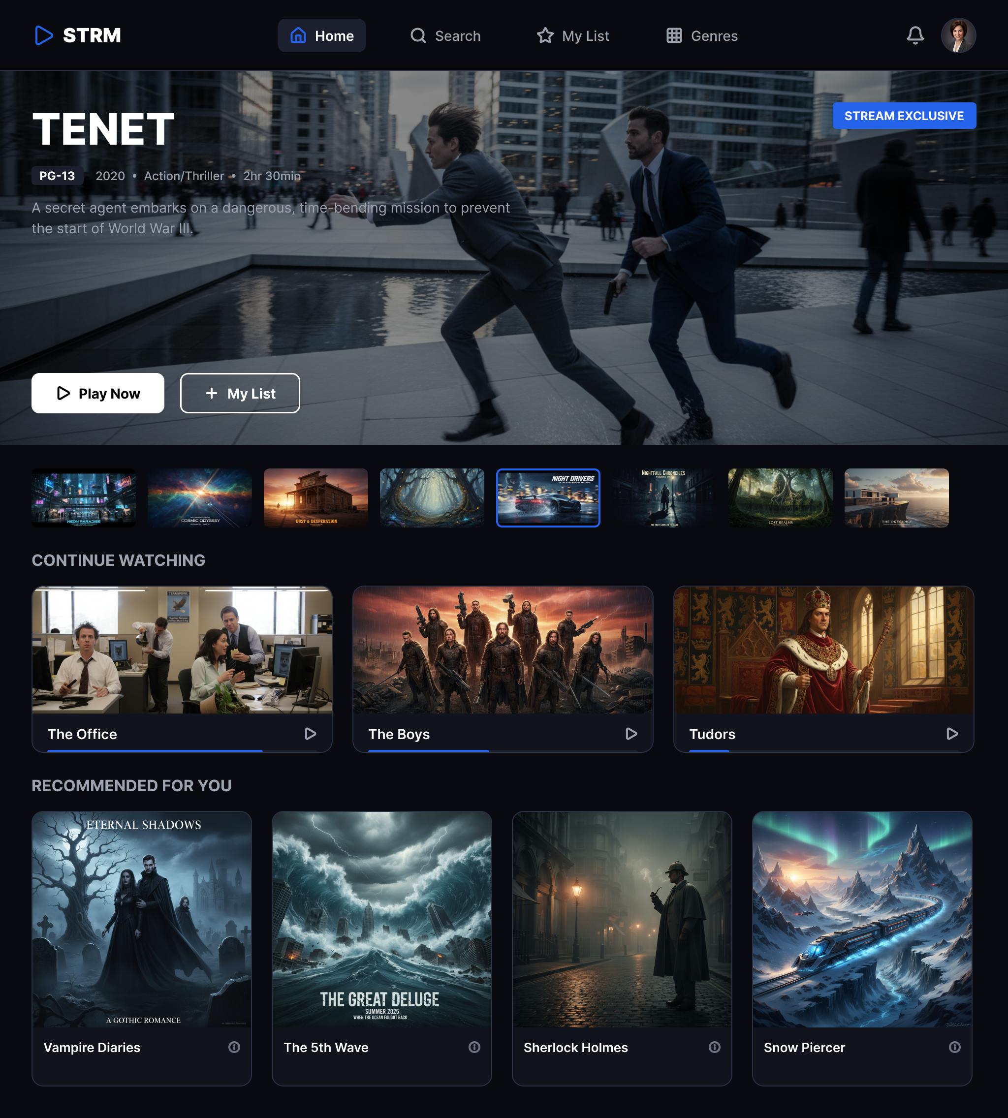
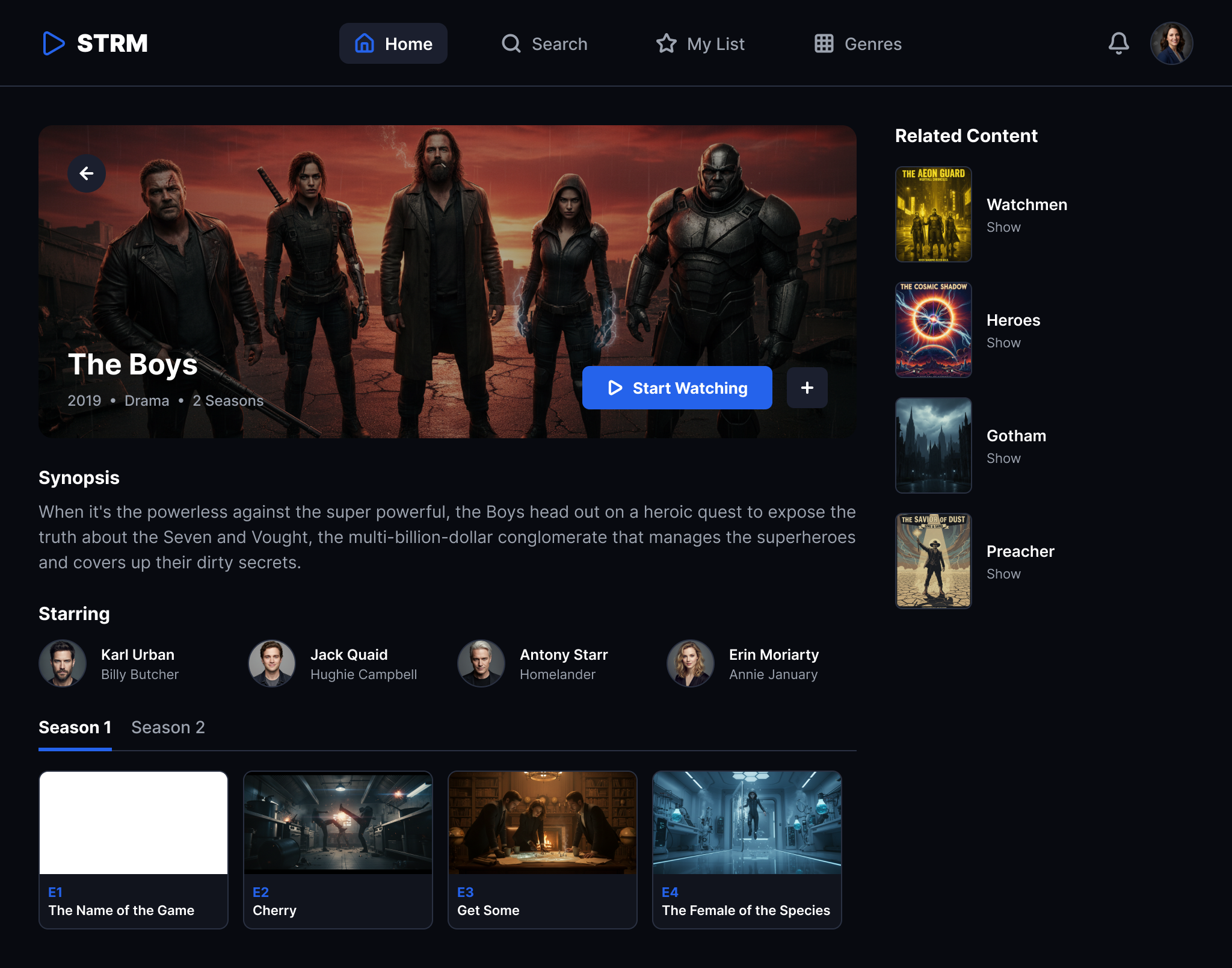
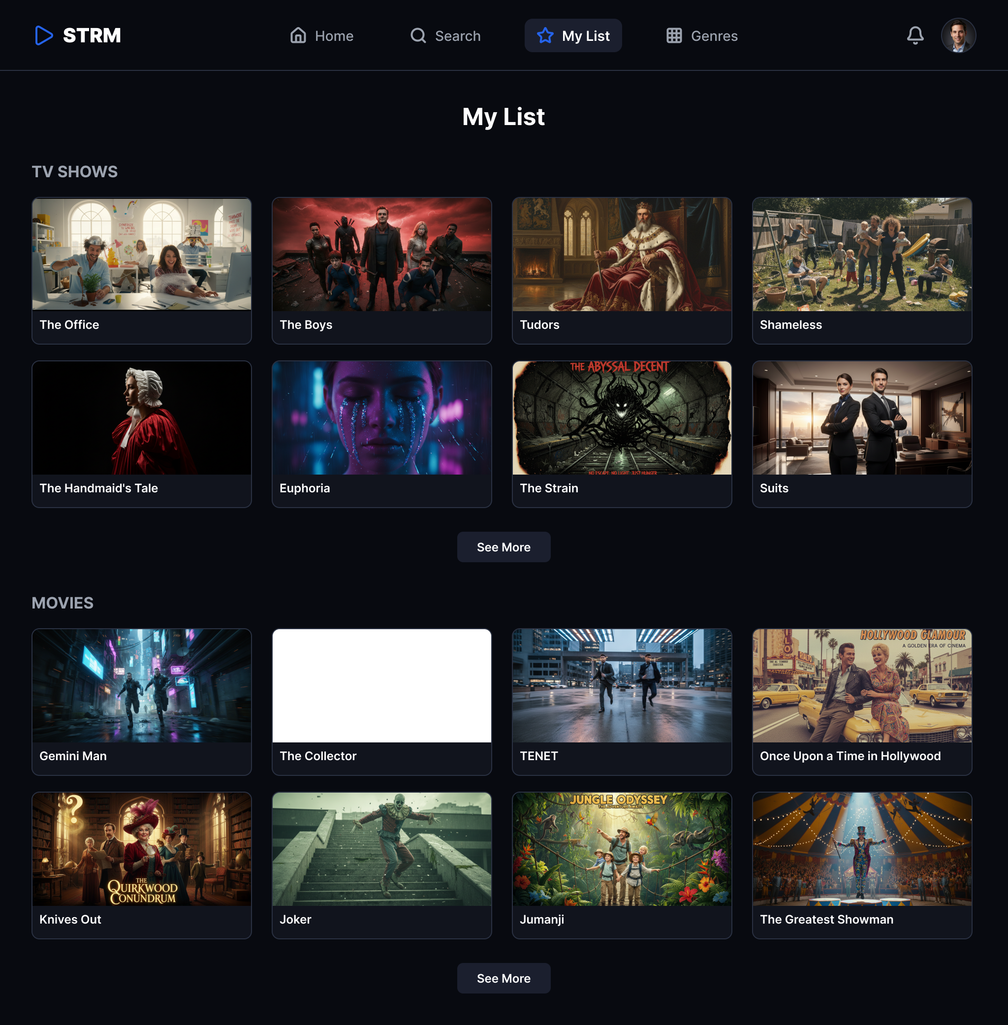
Tablet layouts adapt the same content hierarchy to touch-first interactions. Poster grids expand to fill the wider viewport, while the detail view integrates Related content into a sidebar rather than a separate screen.
Onboarding
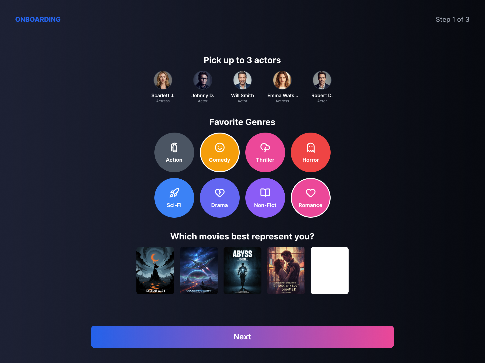
Case Study
From wireframe to final UI
Comparing the structural wireframe with the finished high-fidelity design reveals how visual treatment transforms the same information architecture.
Landing Page Evolution
The same hero-dominant layout with content rows beneath — the wireframe establishes spatial hierarchy while the final UI adds cinematic imagery, dark theme, and typographic refinement.
Show Details Evolution
The detail page maintains its two-column structure (primary content + related sidebar) from wireframe to final — validating that the wireframe accurately predicted the production layout.
Reflection and takeaways
Multi-device design patterns
Designing for TV, tablet, and potentially mobile simultaneously surfaces fundamental questions about content hierarchy adaptation. The same content catalog requires fundamentally different navigation paradigms — remote-driven 10-foot interfaces vs. touch-based direct manipulation — while maintaining brand consistency.
What this exercise demonstrates
- Adapting a single content architecture across TV, iPad, and mobile form factors
- Wireframe-first process that validates structure before visual investment
- Dark cinematic UI patterns appropriate for entertainment content
- Onboarding design that builds user profiles through engagement rather than forms
- Component-based thinking across screen sizes
This is a conceptual design exercise — not a shipped product. The designs reflect assumed interaction models based on competitive analysis of existing streaming platforms. Production-readiness would require user research, accessibility auditing, motion design, and engineering feasibility review across target devices.
Self-initiated conceptual redesign. Not affiliated with or commissioned by any existing streaming provider.