Product Design Case Study
Self-initiated concept project
Medical App — Exploring a Clearer Path from Symptoms to Health Information
An early mobile-health concept exploring symptom entry, body-based navigation, health information, and personal medical records.
- Role
- Daniela — Designer
- Platform
- iOS Mobile
- Original Year
- 2021
- Scope
- 5 Core Concepts
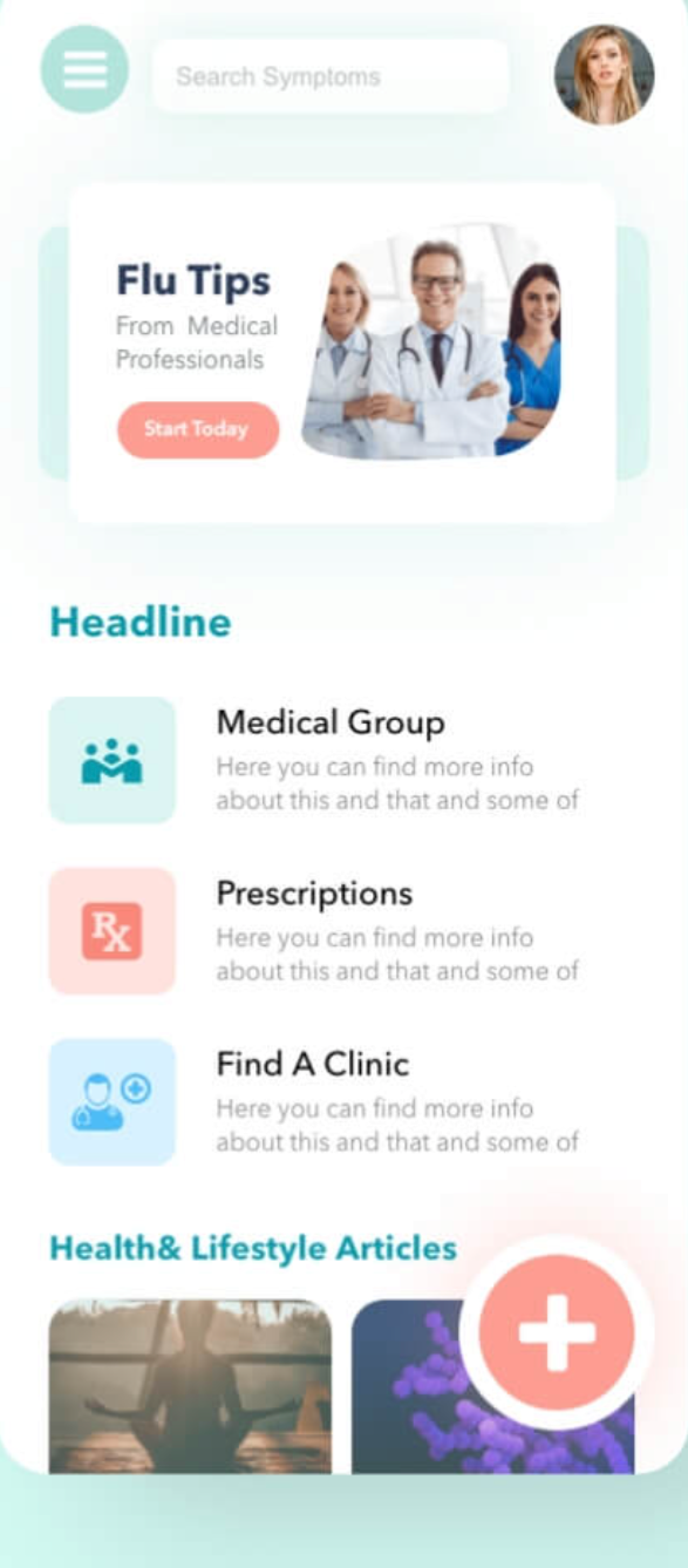
- 1. Landing Default
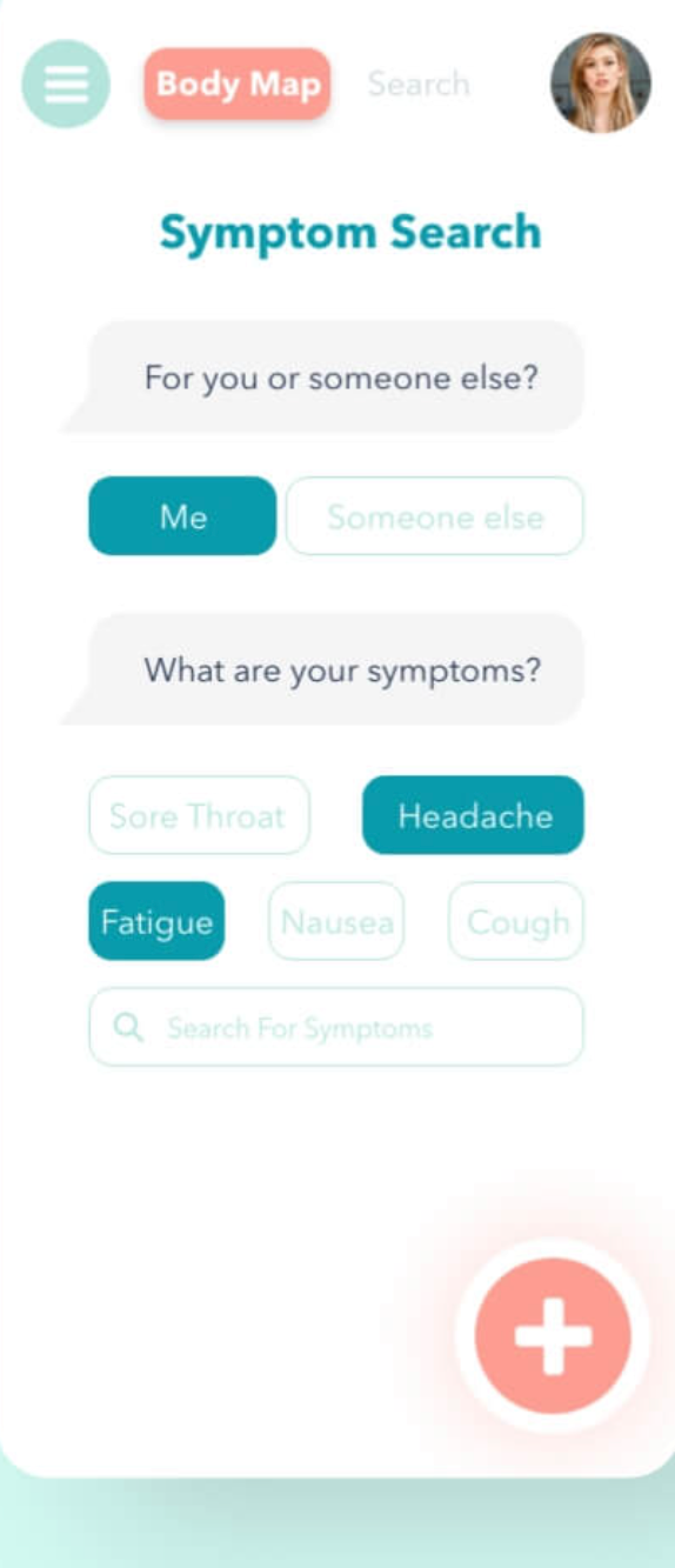
- 2. Symptom Search
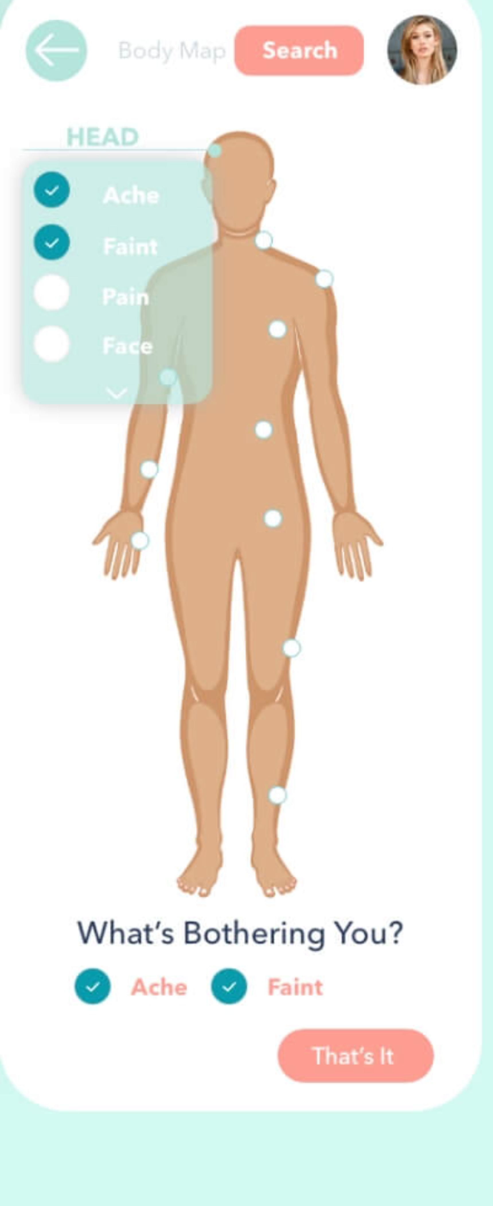
- 3. Body Map System
Self-initiated conceptual project. Not medical advice. Not clinically validated or affiliated with a healthcare provider.
Context & objectives
Understanding the original concept
The medical application project originally explored a broad mobile-health hub concept designed to streamline the way users interact with personal health information. The core experience was structured around giving patients a seamless, intuitive toolset to manage their care journey:
Search symptoms
A smart search interface that helps users identify potential conditions based on intuitive queries.
Indicate discomfort on a body map
A visual, touch-based interactive body map that translates physical sensation locations into health system inputs.
Access health-related resources
Curated, trustworthy reference libraries containing relevant medical information and articles.
Reach care-finding functions
Direct integration channels to find, map, and contact clinics or healthcare professionals nearby.
Review a personal medical profile
A secure, consolidated patient record dashboard housing history, details, and active prescriptions.
Integrity statement
This case study documents and reflects on an original conceptual project. It does not claim clinical validation, user-research findings, usability results, or measurable health outcomes.
Original work — 2021
Where the project started
Original visual concepts
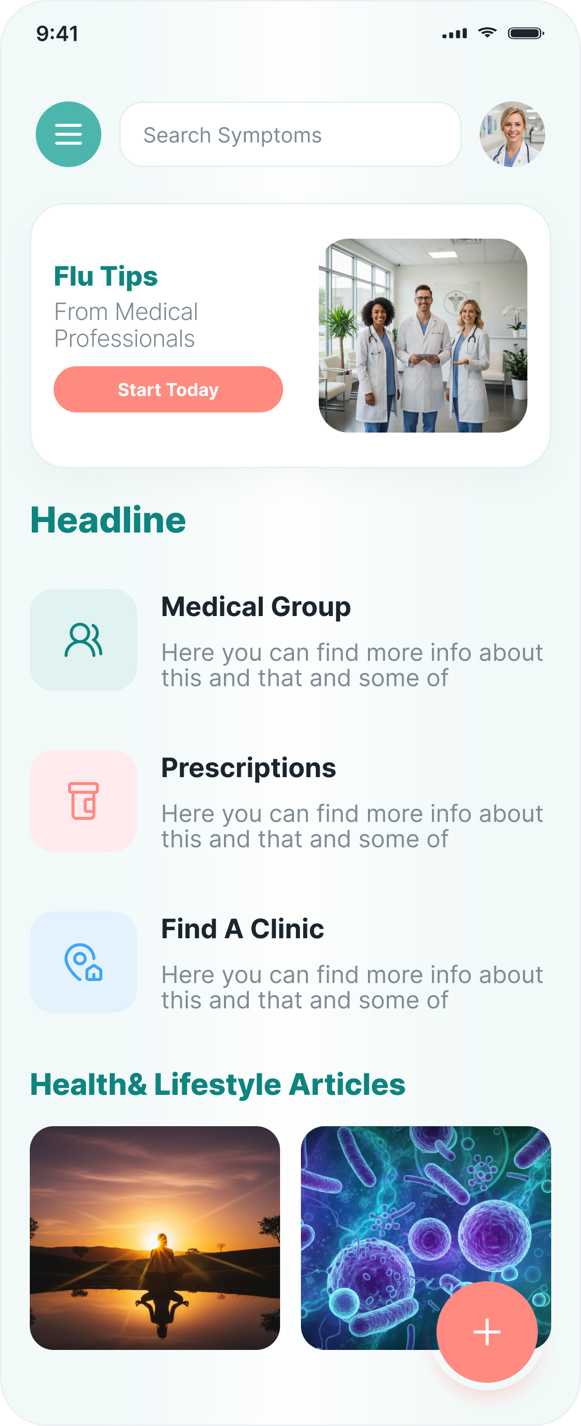
MED_01 Landing 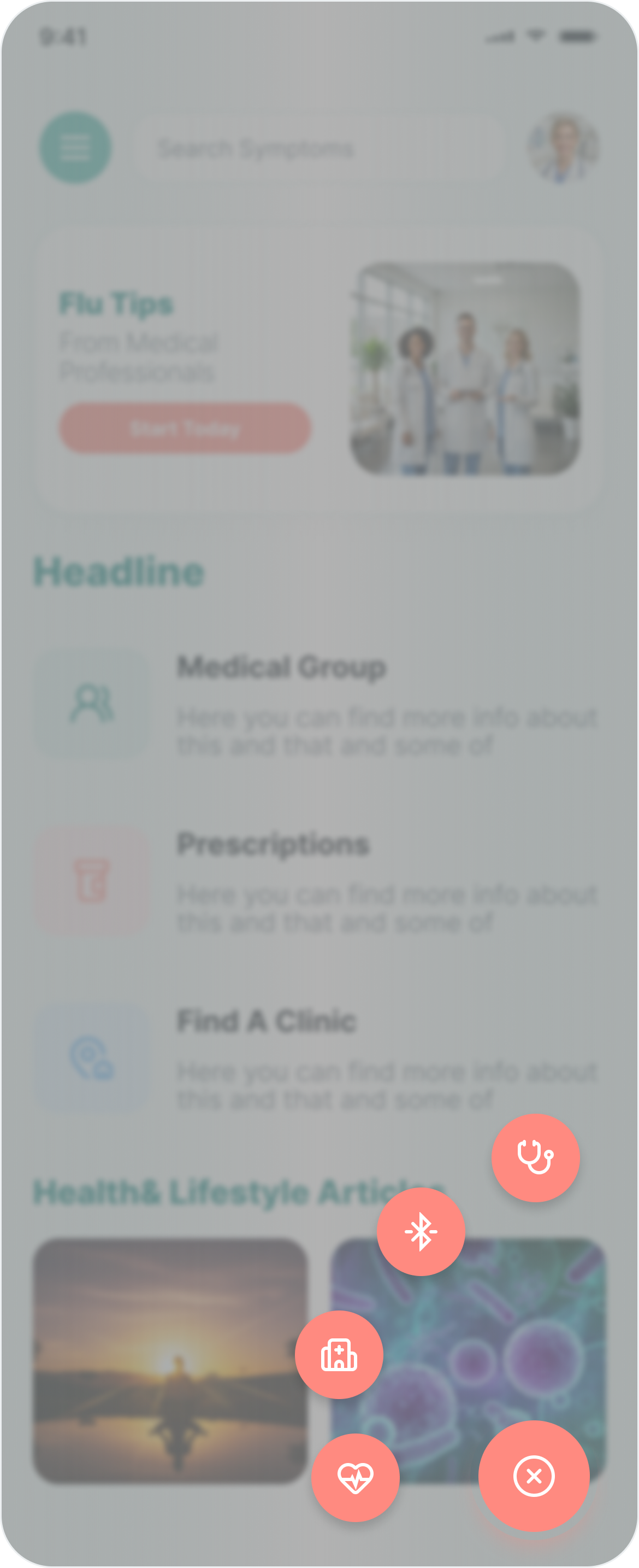
MED_02 Menu 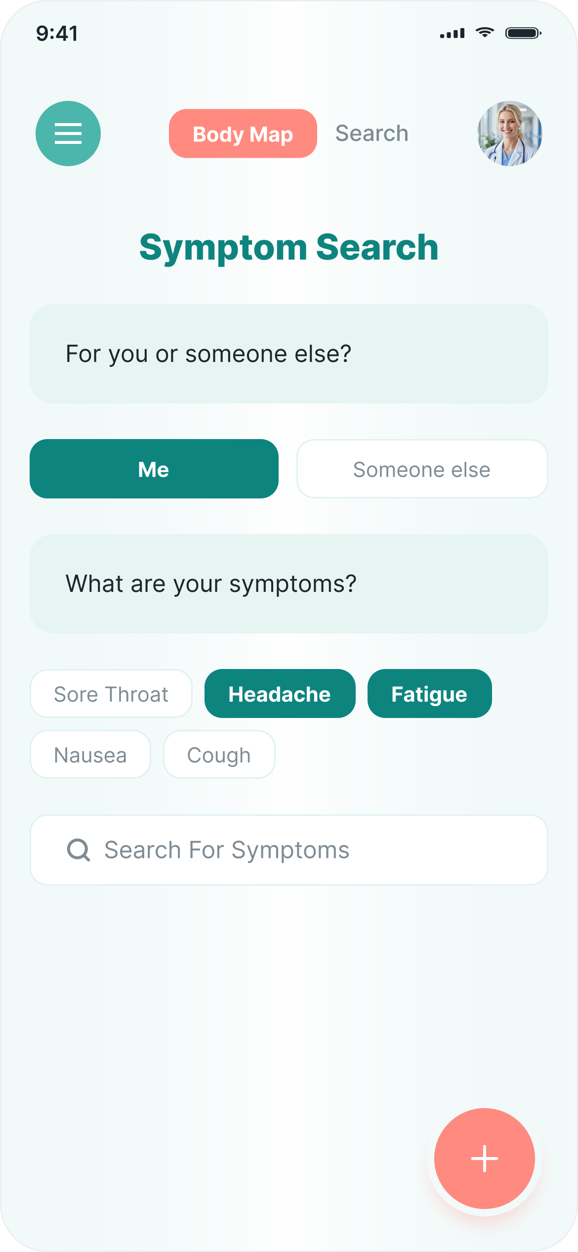
MED_03 Search 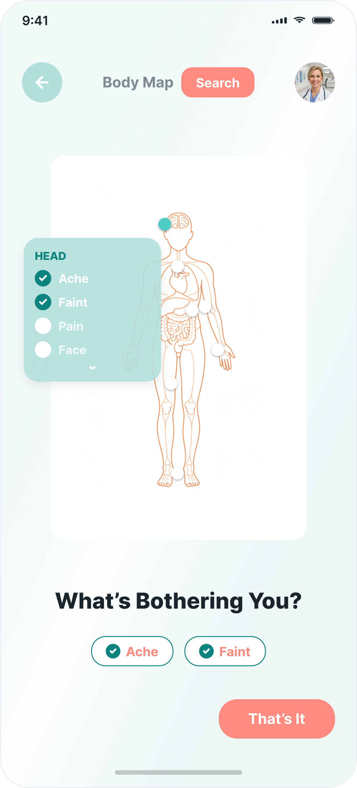
MED_04 Body Map 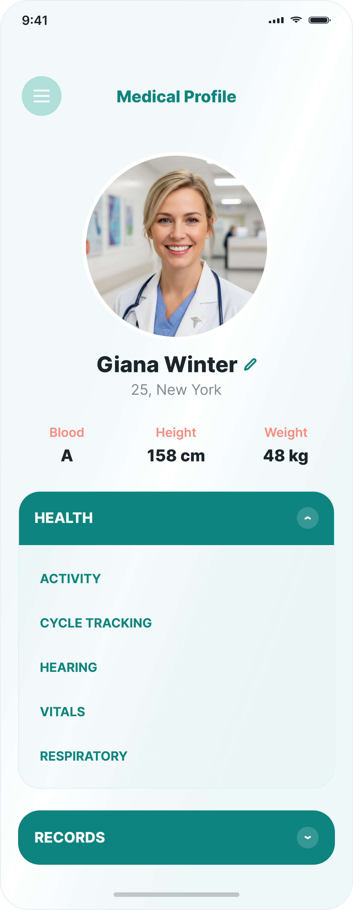
MED_05 Profile
Early wireframes
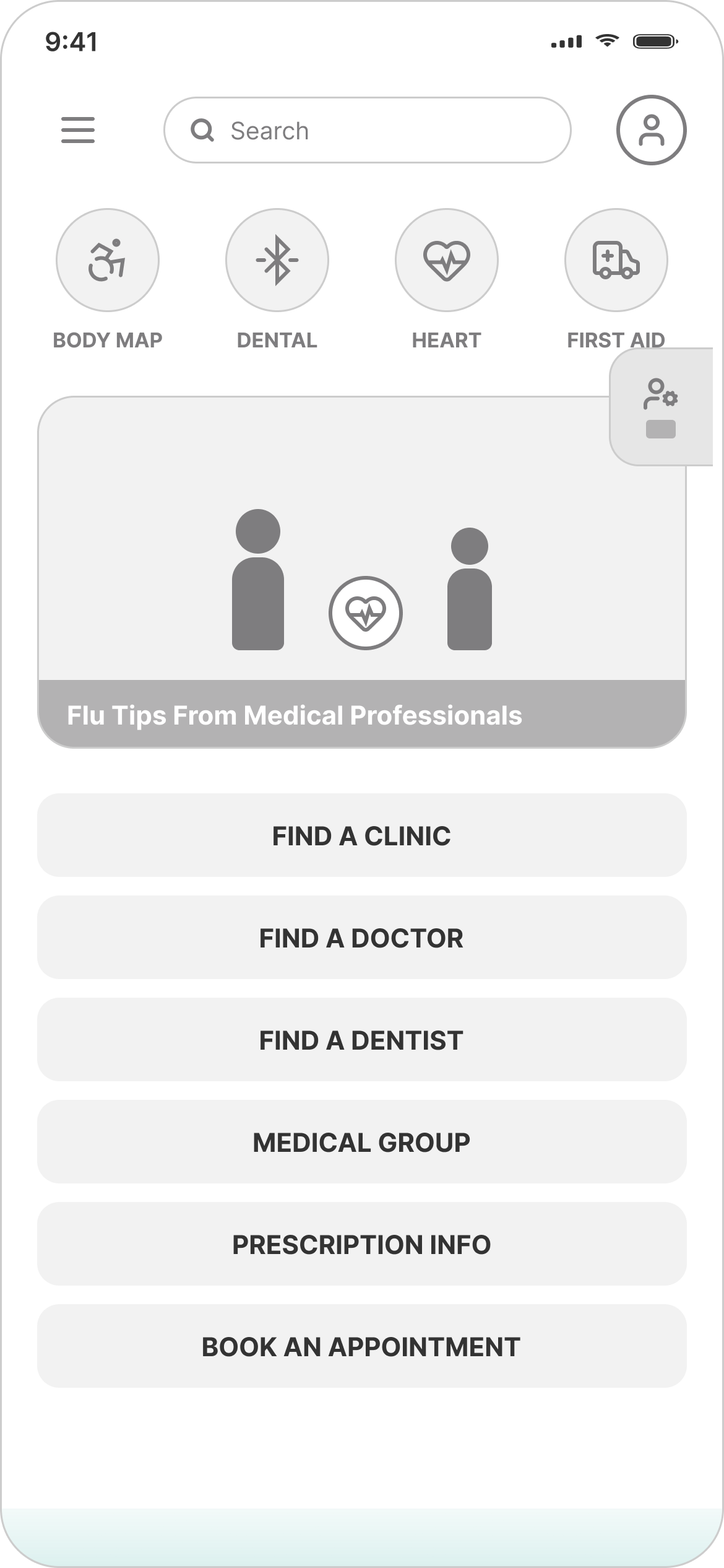
WF_01 Wireframe 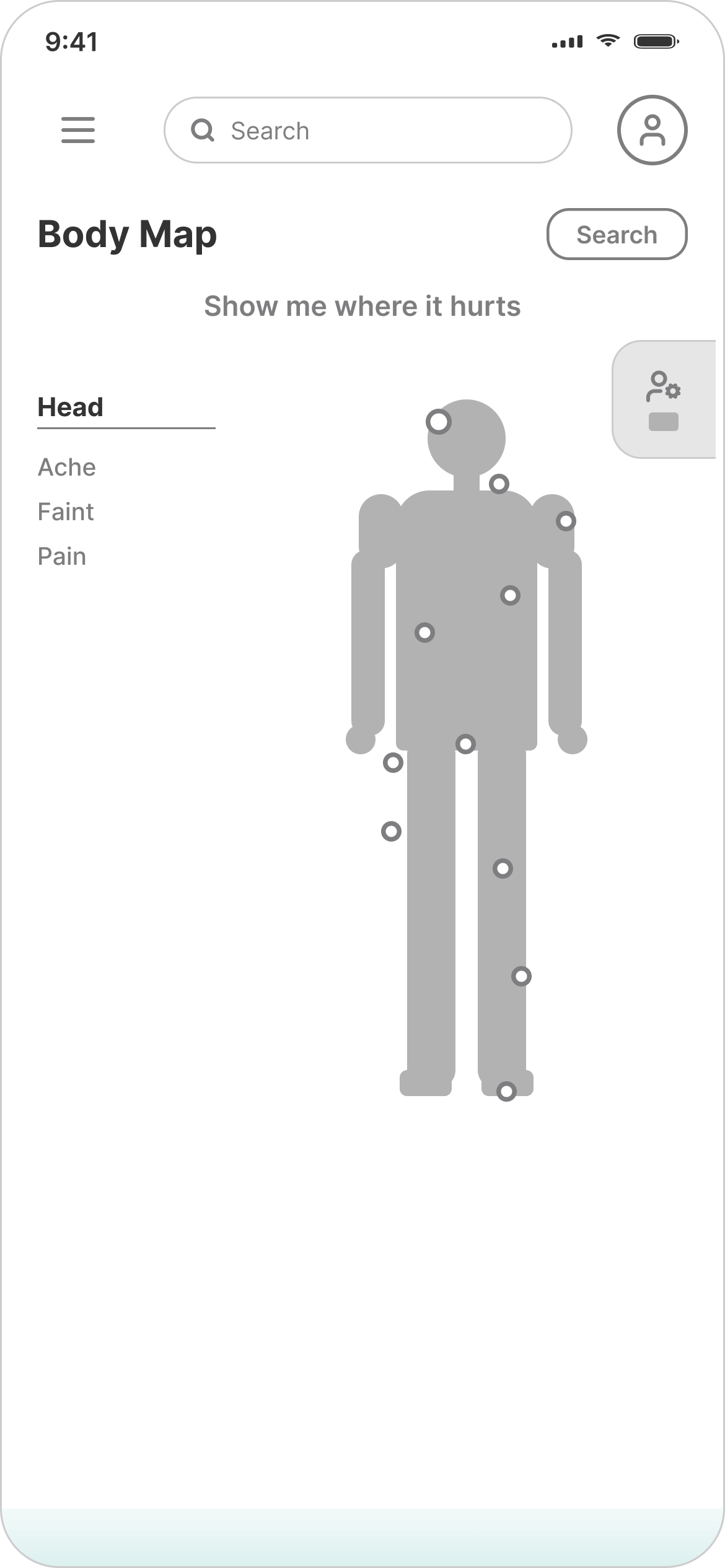
WF_02 Wireframe
Existing high-fidelity screens
HF Screen 01 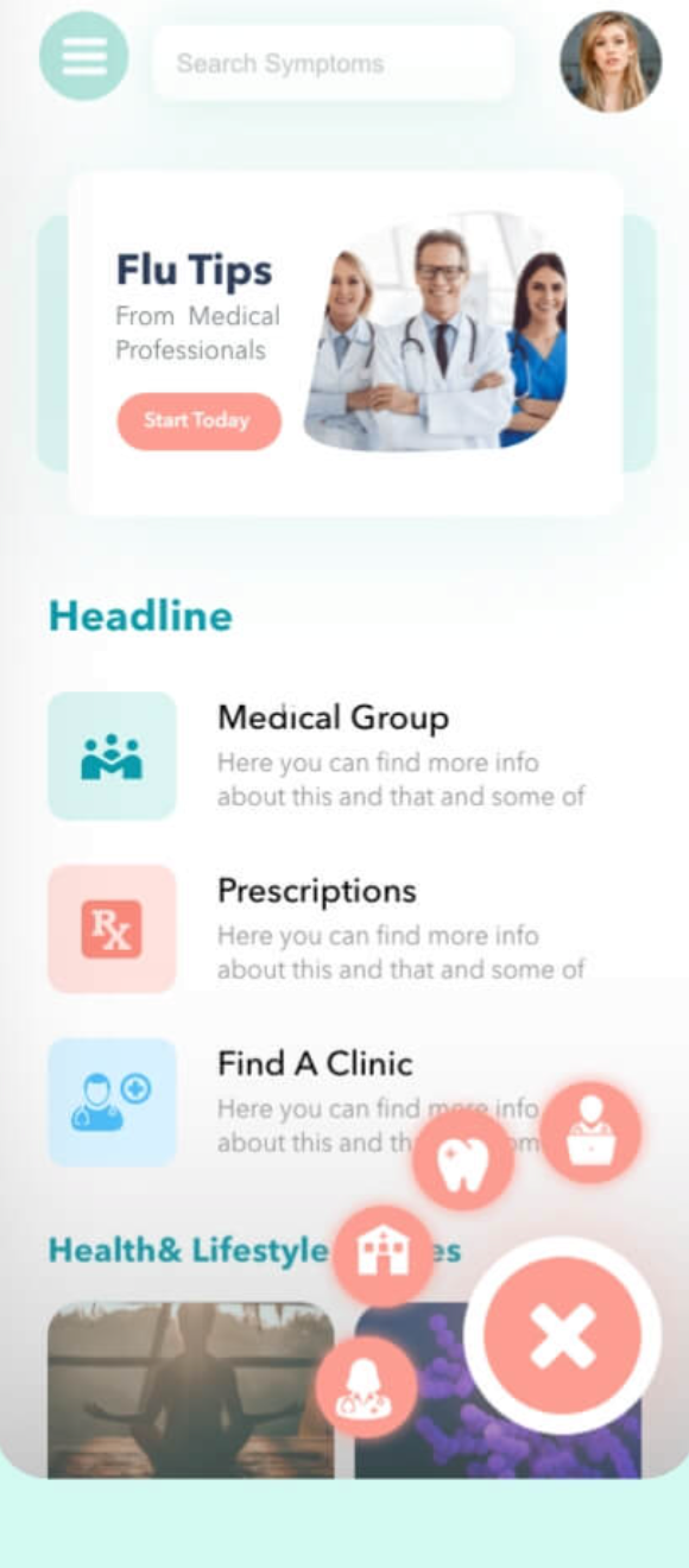
HF Screen 02 HF Screen 03 HF Screen 04 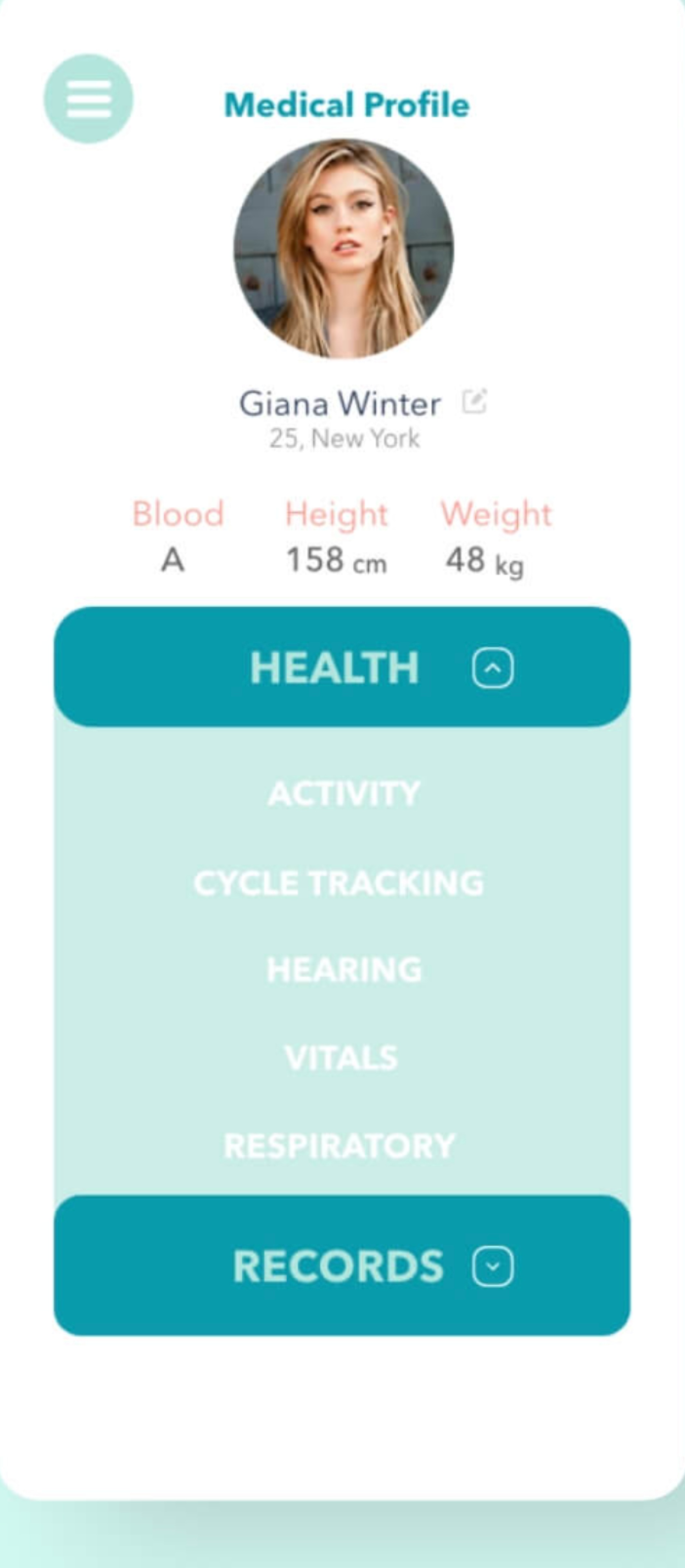
HF Screen 05
What was worth preserving
- A consistent teal and coral visual identity
- An approachable health-information tone
- Exploration of symptom search and body-based input
- A centralized concept for health resources
- Early attention to personal medical information
What needed to evolve
- The product scope was extremely broad
- The user problem was not clearly defined
- No research evidence supported the feature set
- Several flows were represented only as isolated screens
- Clinical safety boundaries were not documented
- Privacy and consent requirements were not addressed
- Accessibility behavior was not specified
- The experience lacked a complete end-to-end task flow
04 — Problem & scope
Narrowing the concept to an understandable experience
“How might a conceptual mobile experience help users organize symptom information while clearly avoiding diagnosis or medical-advice claims?”
The core problem statement
People looking for health information may struggle to describe what they are experiencing or determine where to begin. The original concept explored whether symptom selection and body-based navigation could provide a more understandable starting point.
In scope
- Health-information landing page
- Symptom selection
- Body-area selection
- Personal medical profile
- Navigation between these existing concepts
Out of scope
- Diagnosis
- Treatment recommendations
- Emergency triage
- Prescription management
- Provider integration
- Insurance processing
- Clinical decision support
- Medical-record interoperability
Safety principle
The interface may help organize information, but it must not imply that it can diagnose a condition or replace professional medical care.
05 — Core experience
The experience represented in the original screens
Step 1 — Landing
Discover available health-information paths.
Step 2 — Action Menu
Reveal additional health-related actions.
Step 3 — Symptom Search
Select or search for symptoms.
Step 4 — Body Map
Associate symptoms with areas of the body.
Step 5 — Medical Profile
Review categories of personal health information.
Conceptual interface sequence reconstructed from the available 2021 screens—not a validated user journey.
Visual system reconstructed from the original interface—not the project's original documented design system.
Reconstructing the original visual language
01 / Color palette
- Teal #3BB5ADPrimary / brand accent
- Coral #FF6B6BSecondary / highlights
- Mint #F0FAF9Muted backgrounds
- White #FFFFFFSurfaces
- Navy #1A2B3DPrimary text
- Gray #6B7B8DSecondary text & borders
02 / Typography hierarchy
Display Style
Inter Bold · 28px
Health Resources
Section Heading
Inter SemiBold · 20px
Symptom Checker
Body Paragraph
Inter Regular · 14px
Track your symptoms and access health guidance.
Micro Caption
Inter Regular · 12px
Last updated 3 hours ago
03 / Component reconstructions
Menu list row item
Update Personal Records
Aesthetic geometry
Corner Radius: 12px Default
Base Rhythm Grid: 8px Multiples
Content card module
Recommended Care Routine
Based on your entered symptoms, local primary care consultation is suggested.
Interactive markers
Active Body Node
Navigation items
OverviewReportsHistory
Symptom chips
HeadacheFeverCough
Circular elements
Primary action
Consult Assistant
Project integrity note
Do not claim that formal tokens or component documentation existed in 2021. The metrics, definitions, and components detailed above represent a structural review and clean-up performed post-facto to present the artifact coherently in this case study.
Interactive walkthrough
Key screens and design decisions
Five principal screens demonstrate the core user journey—from the landing experience to symptom exploration to personal health records.
01
Landing
Discover available health-information paths and quick-access tools.
- Clean typographic hierarchy surfaces the most critical facts first
- Familiar touch-points reduce friction during health moments
02
Action Menu
Reveal additional health-related actions through an expandable menu.
- Clean typographic hierarchy surfaces the most critical facts first
- Familiar touch-points reduce friction during health moments
03
Symptom Search
A guided flow for selecting or searching symptoms, distinguishing between the user and someone they're helping.
- Clean typographic hierarchy surfaces the most critical facts first
- Familiar touch-points reduce friction during health moments
04
Body Map
A visual, touch-based way to associate symptoms with specific areas of the body.
- Clean typographic hierarchy surfaces the most critical facts first
- Familiar touch-points reduce friction during health moments
05
Medical Profile
Organizes personal health categories—activity, cycle tracking, vitals, records—within one profile.
- Clean typographic hierarchy surfaces the most critical facts first
- Familiar touch-points reduce friction during health moments
Honest assessment
These screens represent a conceptual exploration—not a validated product. Without user research, the information architecture reflects assumed mental models. The symptom checker flow, in particular, would require extensive clinical review and usability testing before any real-world application. The visual design prioritizes clarity and calm, but accessibility beyond color contrast (screen readers, motor accessibility, cognitive load) remains unaddressed.
08 — Project retrospective
Reflection and next steps
What this project demonstrates
- Reconstructing legacy work into an organized, inspectable Figma file
- Translating low-fidelity wireframes into a cohesive high-fidelity system
- Building a component-based design system from existing interface patterns
- Maintaining visual and structural consistency across multiple screen types
- Presenting portfolio work with honest framing and appropriate caveats
What it does not demonstrate
- Validated user research or usability testing
- Clinical review of health-related interface decisions
- Accessibility auditing beyond basic color contrast
- Real-world implementation or developer handoff
- Stakeholder collaboration or iterative feedback loops
Responsible next steps
If this concept were to move toward production, the following would be essential:
- Conduct user research with target populations (patients, caregivers, clinicians)
- Partner with medical professionals to validate symptom-checker flows
- Perform comprehensive accessibility audit (WCAG 2.2 AA minimum)
- Build and test with real data under privacy-compliant conditions
- Establish content governance for health information accuracy
This case study documents a self-initiated design exercise — reconstructing, organizing, and modernizing a 2021 project. It reflects current design skill and process thinking, presented with the transparency that portfolio work deserves.