
Multi-Device Product Design
Williams-Sonoma — E-Commerce Redesign
Elevating the digital presence of a premium luxury home furnishing brand across tablet, iPad, and mobile form factors.
- Brand
- Williams-Sonoma
- Industry
- Furniture & Home Decor
- Role
- UI & UX Designer
Daniela Koulentianos
UX/Product Design Portfolio
Context & Strategy
Redesigning a premium home furnishing experience
The Challenge
Williams-Sonoma represents the pinnacle of premium, sophisticated decor. However, their legacy mobile e-commerce platform fell short of translating that tactile, rich in-store design narrative to digital touchpoints. High-end buyers struggled with clunky exploration routes and nested interfaces.
The objective was to design a clean, responsive layout across tablet and mobile that champions high-fidelity, editorial imagery, makes room-based and category exploration organic, and builds confidence through rich, detailed craftsmanship stories.
Visual Direction
Defining the luxury aesthetic — warm, timeless, curated
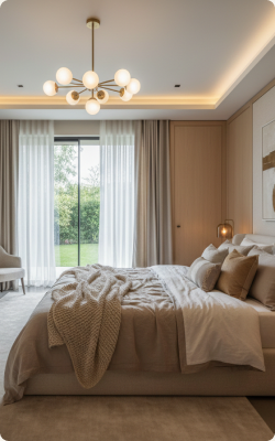
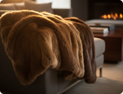
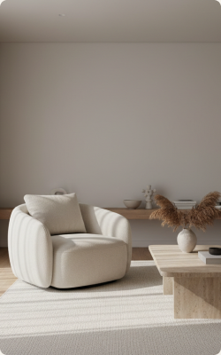
Our visual identity matches the physical brand legacy: deep warm charcoals, soft golden accents, and natural linen creams. By utilizing a high-contrast typographic hierarchy and spacious grids, we elevate product layouts to read like premium gallery lookbooks.
Aesthetic Color Story
- Warm Gold#C5A059
- Olive Dark#2E362E
- Charcoal#1C1A17
- Canvas#FCFBF9
- Nut Walnut#6B4226
Brand Attributes
- Timeless
- Crafted
- Organic
- Heritage
- Curated
- Artisan
- Luxury

Design Process
Structuring the shopping experience — low fidelity wireframes
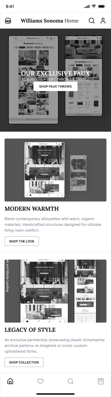
1. Editorial Landing Page
Low-fi blueprint mapping exclusive faux-fur and seasonal collections. Emphasizes bold typography layout paired with high-impact lifestyle image rows.
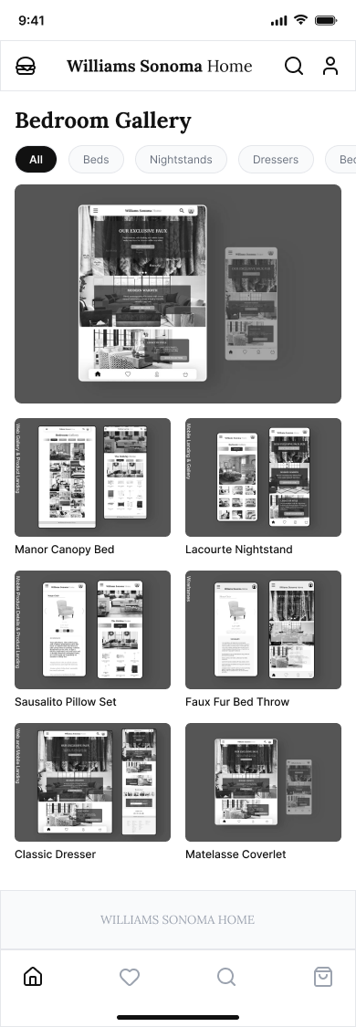
2. Gallery & Room Browse
Mapping a grid for 'Shop by Room' interactions. Horizontal category pill tabs (Bedroom, Bath, Living, Kitchen) allow instant content shifts.
Information architecture focused strictly on simplifying user flows. By isolating layout structure from rich lifestyle images, we ensured the primary commerce actions remain accessible.
Final Design
High-fidelity UI — heritage meets modern e-commerce
Tablet & iPad Experience
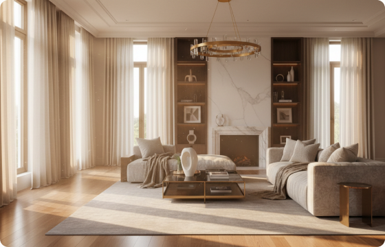
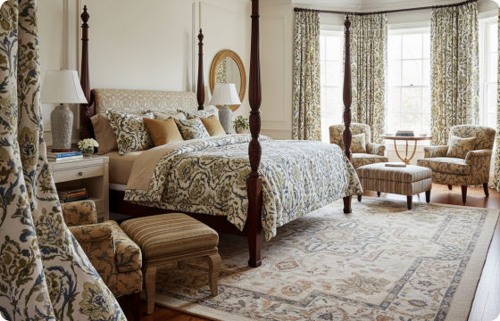
Tablet layouts maximize screen real estate to mimic catalog-like editorial spacing. High-definition lifestyle photography anchors the primary user focus, with subtle clean buttons overlaid.
Mobile UI Flow
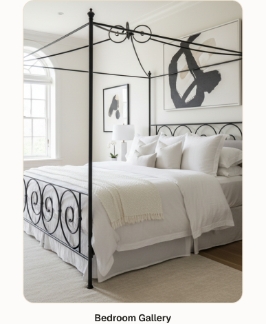
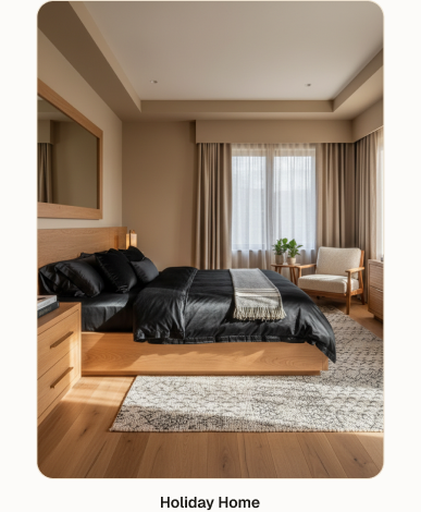
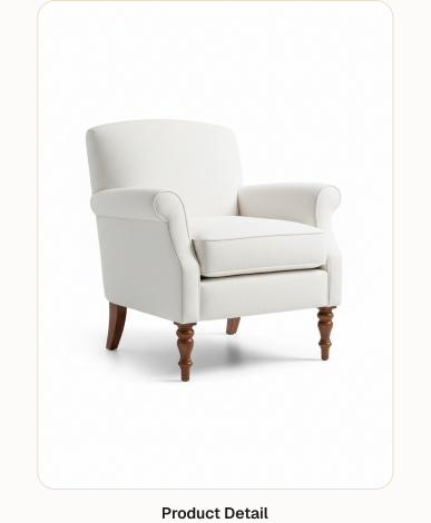
Mobile screens adapt touch gestures beautifully. The checkout funnel is flattened into simple product cards featuring high-contrast typography, interactive swatches, and clear primary CTA targets.
Design Spotlight
Key design decisions that drove conversion
Editorial Product Photography
We replaced traditional sterile e-commerce white backgrounds with rich contextual room-scene imagery. Selling the lifestyle rather than just individual objects builds organic customer aspiration.
Room-Based Browsing Mode
Instead of forcing users to dig through endless dropdown categories, a clean tab-based 'Shop by Room' gallery filters collections instantaneously without full-page loads.
Artisanal Product Storytelling
Upholstery detail, sustain-harvest wood frames, and custom USA-build badges are brought to the foreground, conveying luxury value transparently.
Evolution
From wireframes to final UI
E-Commerce Landing Page Evolution
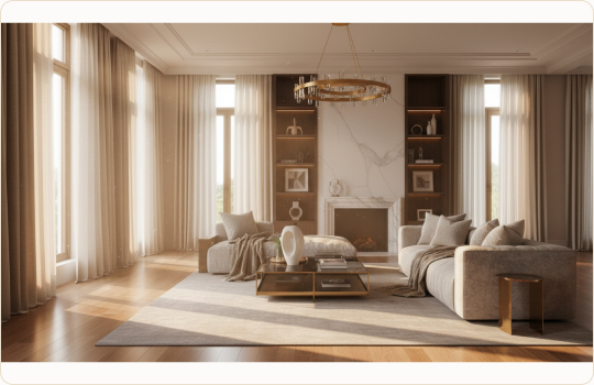
Visualizing the transition: the grey-box schematic successfully mapped the balance of bold headings and large image blocks, making final cinematic textures integrate fluidly.
Learnings
Reflection and takeaways
What I learned
Designing for premium retail requires a strong restraint on UI details. Overly complex widgets, flashy graphics, and loud animations cheapen the product value. Luxury is signaled by space, deliberate typography, and letting the product design itself breathe on canvas.
Integrating a cohesive room-focused architecture taught me to treat mobile grids as scrollable editorial magazine pages rather than basic database rows.
What I would do differently
In the future, I would conduct more rigorous live user testing with high-end furniture buyers to measure brand trust and confidence metrics during fabric swatch customization flows.
Additionally, exploring AR (Augmented Reality) room placement previews would be an excellent secondary project phase to reduce returns on bulky furniture items.
Conceptual design case study. Williams Sonoma Home is a registered trademark. All assets and mockups created for portfolio demonstration.